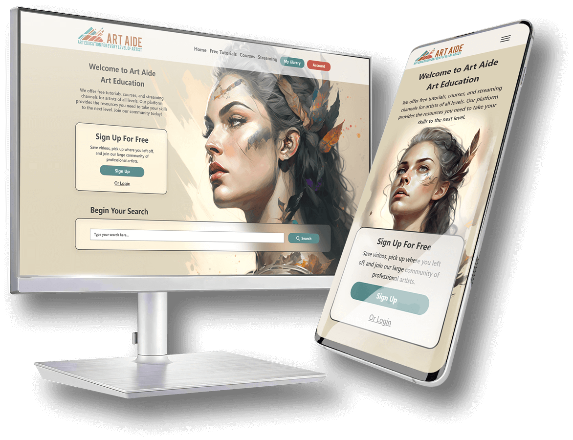
Responsive Website
Art Aide Education Website
Duration:
December 2022 – February 2023
Role:
UX Researcher, UI Designer
Responsibilities:
User Research, Wireframing, Mockup, Low-Fidelity & High-Fidelity Prototyping, Usability Studies
Project Overview
Summary
This is an art education platform built specifically for web on mobile and desktop. It provides students, hobbyists, and professionals a place to learn everything related to art and design.
The Problem
Art education websites on the internet are very niche and do not address specific concerns for most individuals looking to improve their skills. Artists spend a lot of time searching for a specific answer to a problem they are trying to solve creatively and get frustrated when they can’t find what they’re looking for.
The Goal
Create an online educational platform that fulfills the needs of students at all levels and provides them with a very organized and easy to use structure, with both paid and free content.

Accomplishments
Create an application that serves as a solution to provide insight to the customer and act as a supportive tool to enhance the gaming experience.
Key Challenges & Constraints
Create an application that serves as a solution to provide insight to the customer and act as a supportive tool to enhance the gaming experience.
Initial research
Market Research
I interviewed 3 participants ages 30-65 and asked them about how they normally look for art education material and the issues they face when doing so.
I then identified key problems that occur among all groups and developed personas that best address their issues.
I assumed that user of other platforms didn’t have as hard of a time finding content as they do. Even with the prevalence of Youtube, the ability to hone in on specific topics was a key issue among all participants.
Competitive Analysis
Our key competitors are Domestika, a creative educational course website that focuses on courses, Art Station, a digital art education website focused primarily on aspiring industry professionals, and YouTube, an international video website that provides a vast array of content. Domestika and Art Station are both direct competitors while YouTube is an indirect competitor.
Provides very specific tutorials for creatives looking to work in the field of game design, illustration, and animation. They strive to educate, empower, and help artists find the skills, and jobs they truly desire.
An international creative education platform that provides video-based courses for a variety of creative professionals and fields.The largest community of creatives, where you can create, share, and learn.

Provides viewers with a very wide range of knowledge and entertainment. Gives everyone a voice to show them the world.
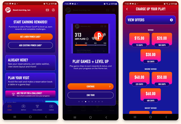
Dave & Busters
The Good
- Excellent use of type, images, and color to emphasize the company brand
- Ability to charge playing card and monitor the balance
- Simple and clean navigation
- Excellent onboarding process with a detailed tour of the application on first use
The Bad
- Content can be a bit too overwhelming visually
- There are no game descriptions on their application
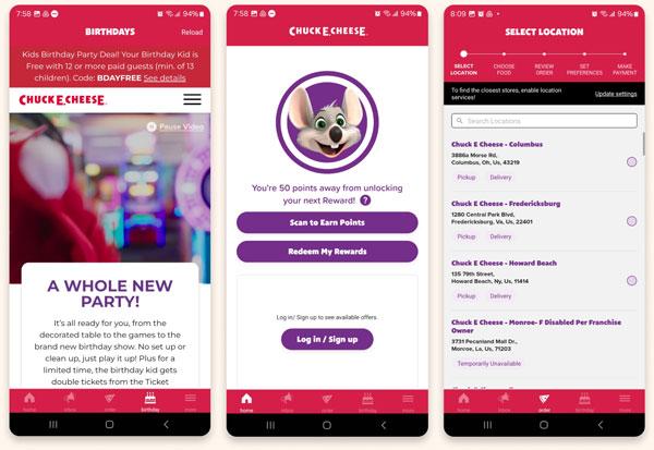
Chuck E. Cheese
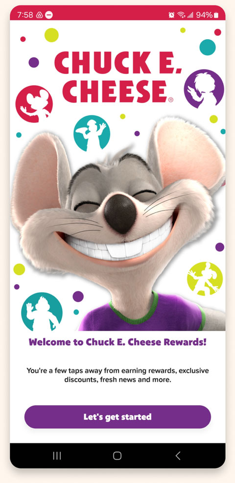
The Good
- Excellent use of type, images, and color to emphasize the company brand
- Ability to charge playing card and monitor the balance
- Simple and clean navigation
- Excellent onboarding process with a detailed tour of the application on first use
The Bad
- Content can be a bit too overwhelming visually
- There are no game descriptions on their application
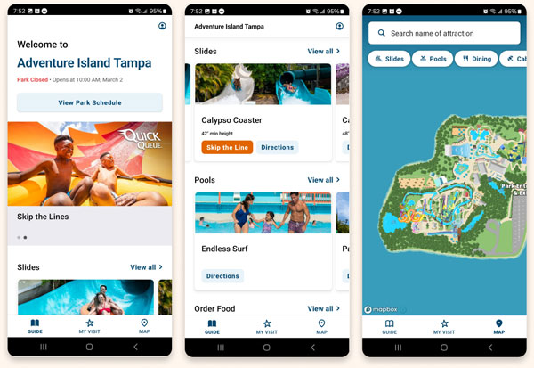
Adventure Island
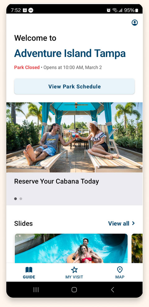
The Good
- Excellent use of type, images, and color to emphasize the company brand
- Ability to charge playing card and monitor the balance
- Simple and clean navigation
- Excellent onboarding process with a detailed tour of the application on first use
The Bad
- Content can be a bit too overwhelming visually
- There are no game descriptions on their application
All About The User
Our key competitors are Dave & Busters, a country-wide arcade and dining company, and Chuck-E-Cheese, an arcade designed particularly for the younger generation. Dave & Busters is a direct competitor to my company as well as Chuck-E-Cheeze. An indirect competitor is Adventure Island, an all-around entertainment and water park.
“Users have a hard time tracking their credits and doing drugs on the weekends thanks dad…”

“Users have a hard time tracking their credits and doing drugs on the weekends thanks dad…”

“Users have a hard time tracking their credits and doing drugs on the weekends thanks dad…”

Pain Points

Finding Specific Content
Users have difficulty finding content that is highly specific and unique. These inquiries often occur when they’ve hit a wall and need assistance.

Too Many Sources
Those looking for any kind of education end up having to use too many platforms that only address certain needs, and often lack well rounded educational material.

Reputable Sources
Artists looking to improve on their knowledge and skills find it difficult to acquire information from reputable and certified educators.

Expensive Options
Some content the user is looking for is packaged into expensive courses, forcing them to spend more money than necessary.

Persona Development & User Journeys
After my initial interviews, I set out to construct 3 archetypes that best fit our users. The unique circumstances of these archetypes helped me to develop 3 user personas with needs, wants, and personality.

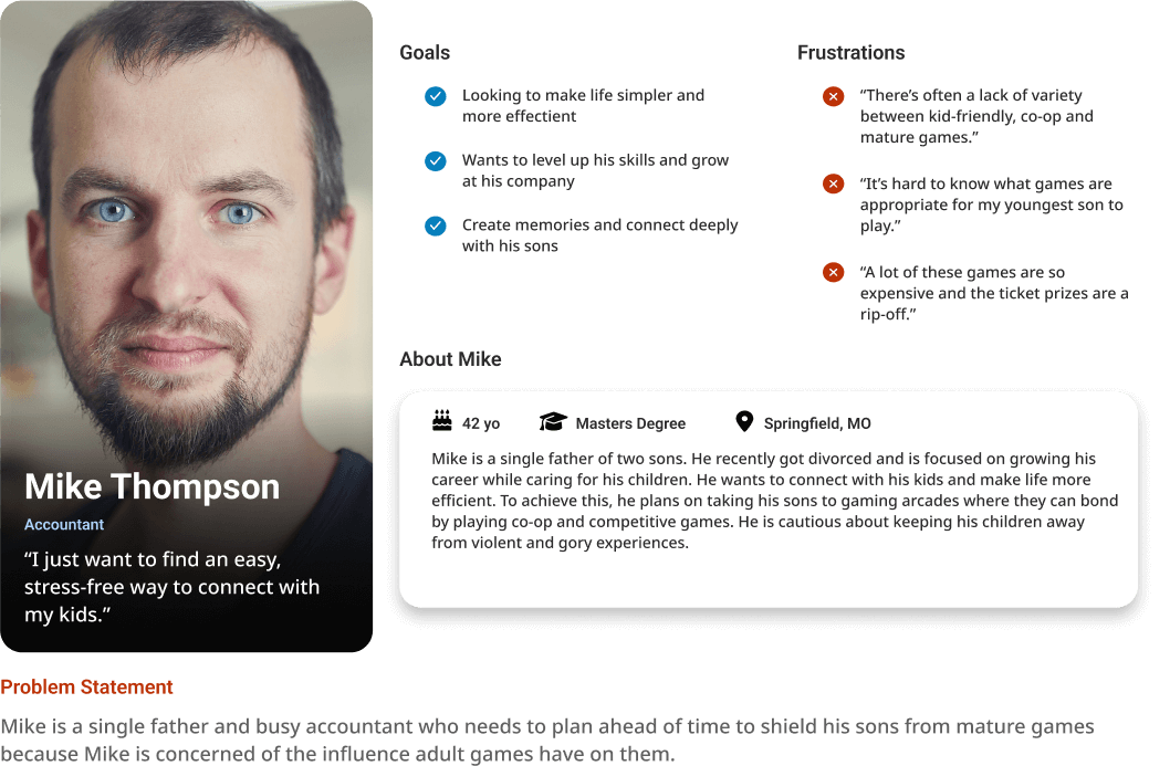
Bill Nguyen
Commercial Professional
Identified the key feature of being able to filter out certain game maturity ratings and identify them on a map.

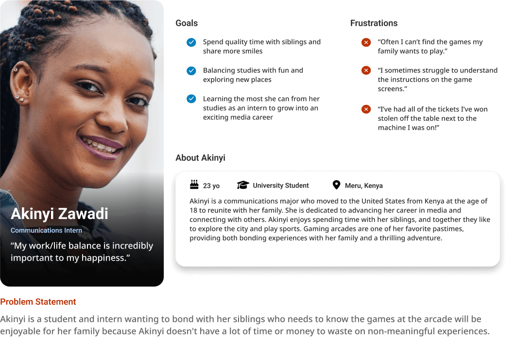
Zack Pringle
Hopeful Professional
Provided insight to the importance of being able to flag a game for damages or malfunctions.

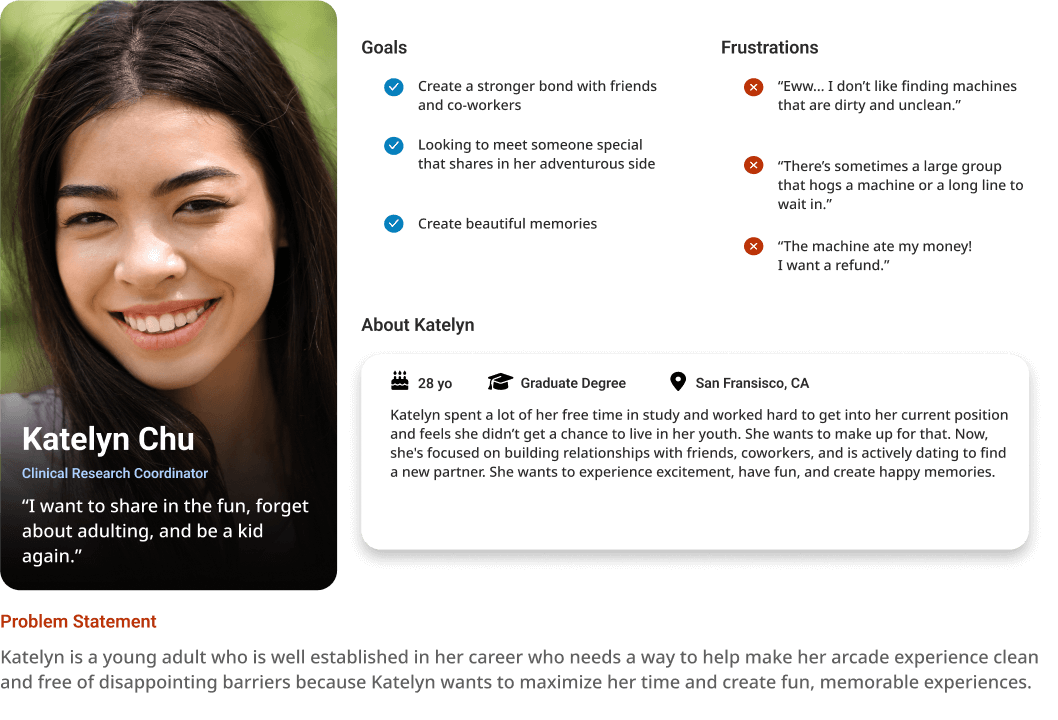
Connie Robbins
Art Hobbyist
Identified key categories to include in filtering the game list.
Bill Nguyen
Zack Pringle
Connie Robbins
Design
User Flow Diagrams
Lorem ipsum dolor sit amet, consectetur adipiscing elit. Aliquam ultrices viverra tellus. Proin pulvinar hendrerit felis a consequat. Maecenas quam lorem, ullamcorper nec luctus sed, molestie vel mauris. Vestibulum nec urna non lacus tincidunt accumsan a sit amet velit. Nam ac sem ut nulla venenatis ultricies.
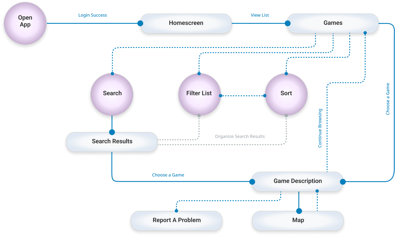
Finding A Game Flow
Lorem ipsum dolor sit amet, consectetur adipiscing elit. Aliquam ultrices viverra tellus. Proin pulvinar hendrerit felis a consequat. Maecenas quam lorem, ullamcorper nec luctus sed, molestie vel mauris.
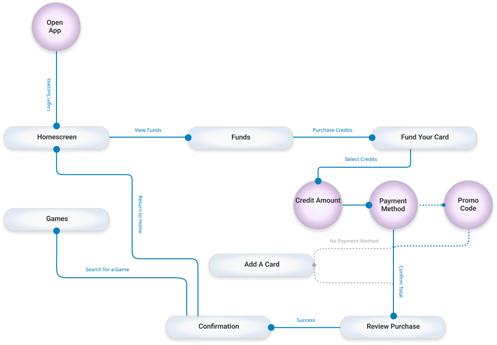
Adding Credits to Account Flow
Lorem ipsum dolor sit amet, consectetur adipiscing elit. Aliquam ultrices viverra tellus. Proin pulvinar hendrerit felis a consequat. Maecenas quam lorem, ullamcorper nec luctus sed, molestie vel mauris.
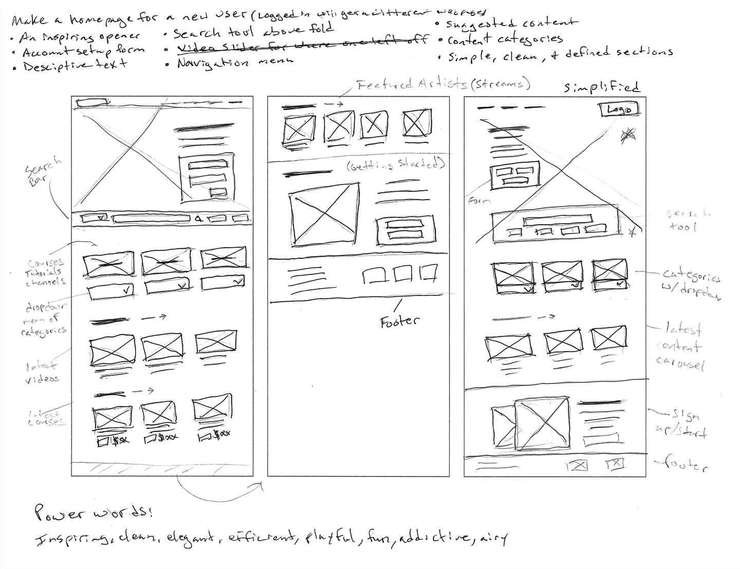
Low-Fidelity Wireframes
Drafting multiple options for the home screen ensured that the most important pain points of our user personas were addressed with appropriate options in the digital wireframes. I provided quick menu items and prioritized funds and funding an account.
Paper Wireframes
Digital Wireframes
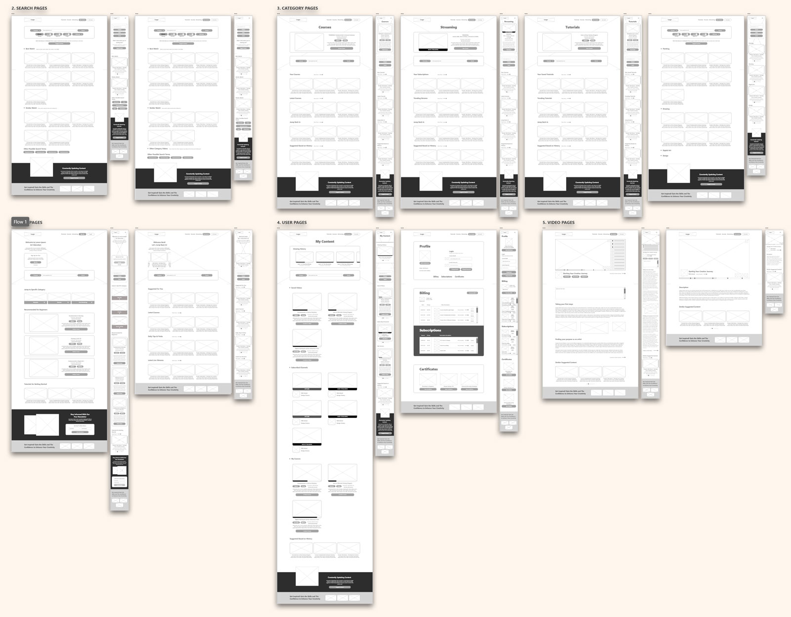
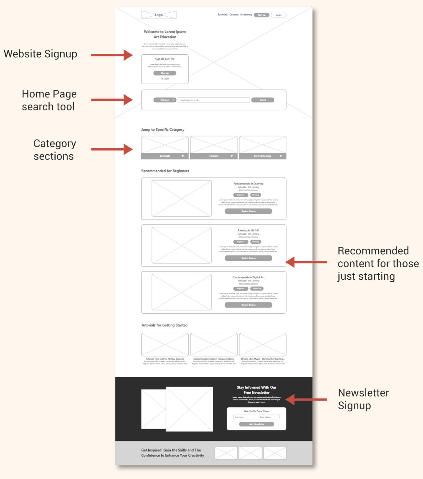
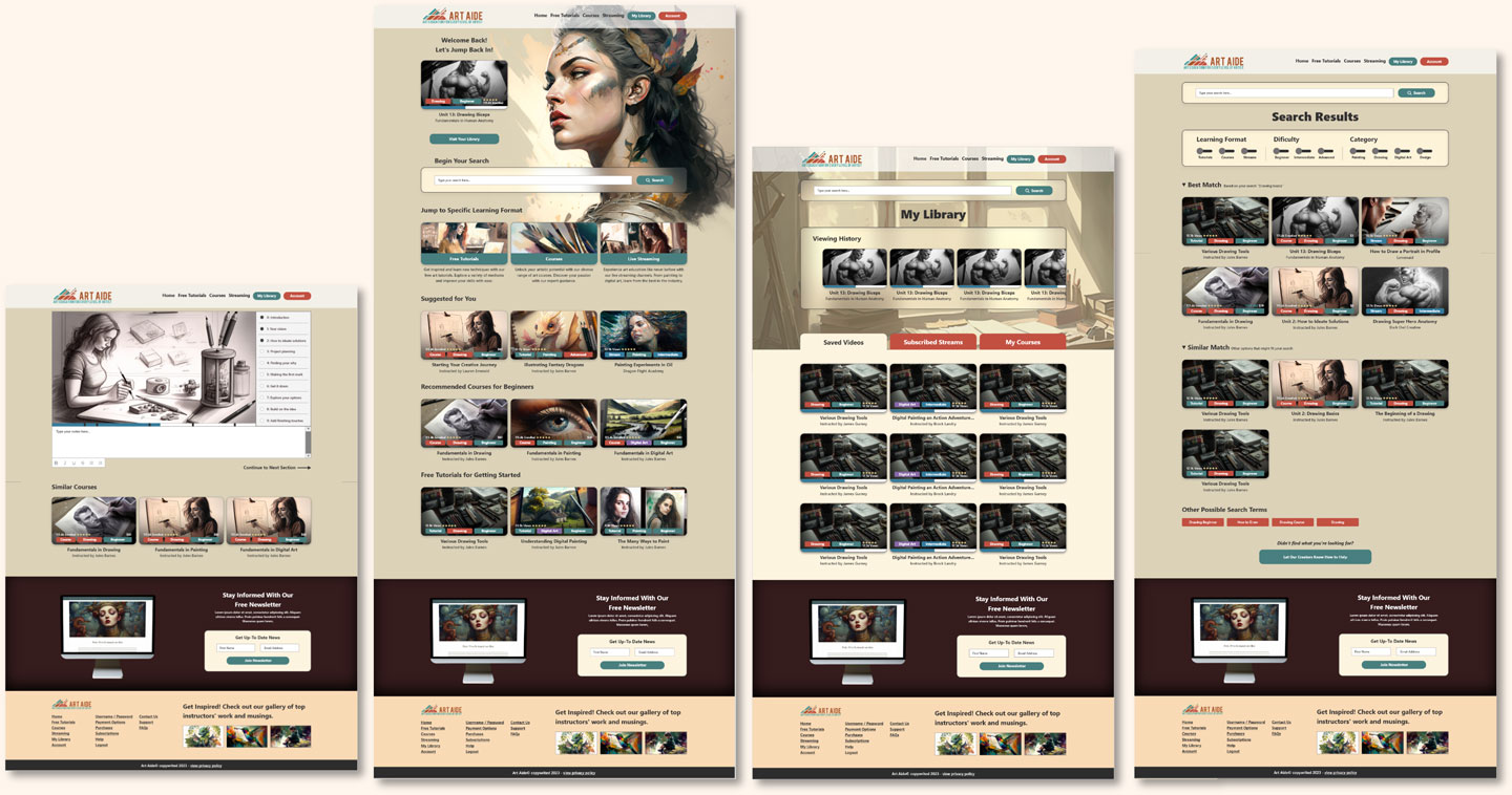
Home Screen
When approaching the homepage design, I wanted the main focus to be on getting right into the content. I have a signup section to get the users to create an account, that way they can track and save content and view history.
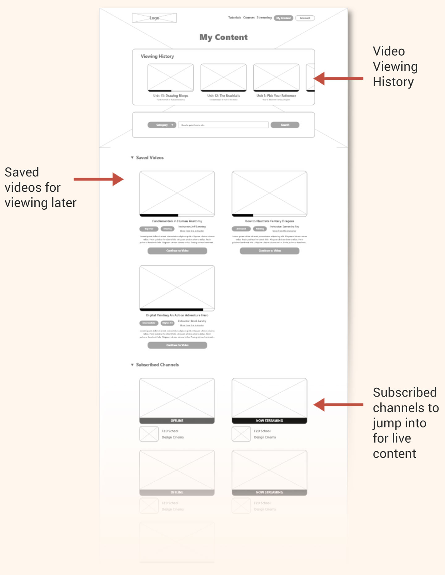
Video Library "My Content"
I wanted my users to have a location they could go to easily jump back into a lesson where they left off, and be able to organize and save specific content, channels, and manage their paid classes.
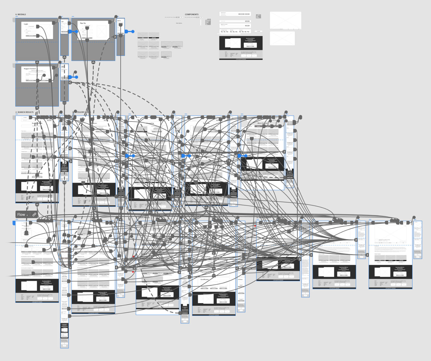
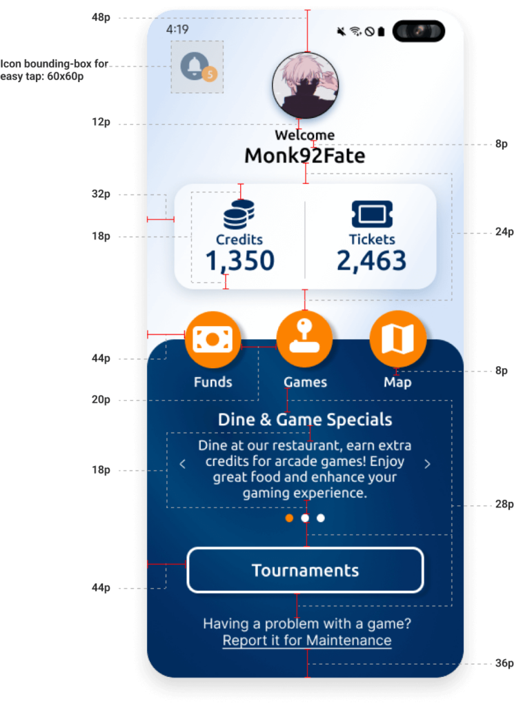
Low-Fidelity Prototype
This website had a lot of moving parts – with modals that needed to overlay the screen to transitions of various components. Here you can see how those connections translate through desktop and mobile.
Accessibility considerations
The low-fidelity prototype provided the primary user flows for looking and filtering for a specific game, signing up for tournaments, adding funds to a game card, and most importantly the ability to report a problem with a machine.
I utilized specific colors that ensured that all buttons and text met usability guidelines specifically for maximum contrast and visibility.
Included voice input features for those who are unable to type and or read the website.
Provided closed caption options for videos so that anyone can view and understand the material during any particular situation.
Color Palette

Font Style
Ubuntu
Regular, Medium, Bold
AaBbCcDdEeFfGgHh
AaBbCcDdEeFfGgHh
AaBbCcDdEeFfGgHh
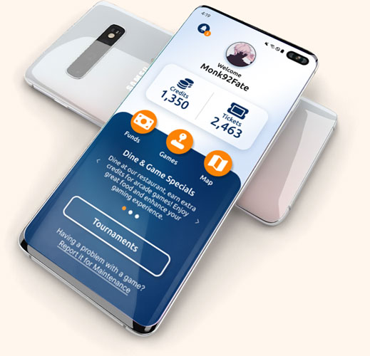
Originally Designed for Android
Original designs were closely attached to the Samsung Android native navigation. With the back button at the bottom right and the time and date at the top. My initial prototype utilized this native feature. However, after user testing showed that anyone not used to the interface, had a difficult time navigating. In order to make the app more acceptable across devices, I switched to a more global means of moving backwards through the user journey. I focused on the native Samsung UI and camera.
Iterating for iPhone Experience
Create an application that serves as a solution to provide insight to the customer and act as a supportive tool to enhance the gaming experience.
Designing for Grid Alignment
Lorem ipsum dolor sit amet, consectetur adipiscing elit. Aliquam ultrices viverra tellus. Proin pulvinar hendrerit felis a consequat. Maecenas quam lorem, ullamcorper nec luctus sed, molestie vel mauris. Vestibulum nec urna non lacus tincidunt accumsan a sit amet velit. Nam ac sem ut nulla venenatis ultricies.
Usability testing
Summary
I conducted two rounds of usability studies. The first study of our low-fidelity application revealed key insights that guided iterations in the design. The second study of our high-fidelity application revealed additional iterations that needed to be completed.
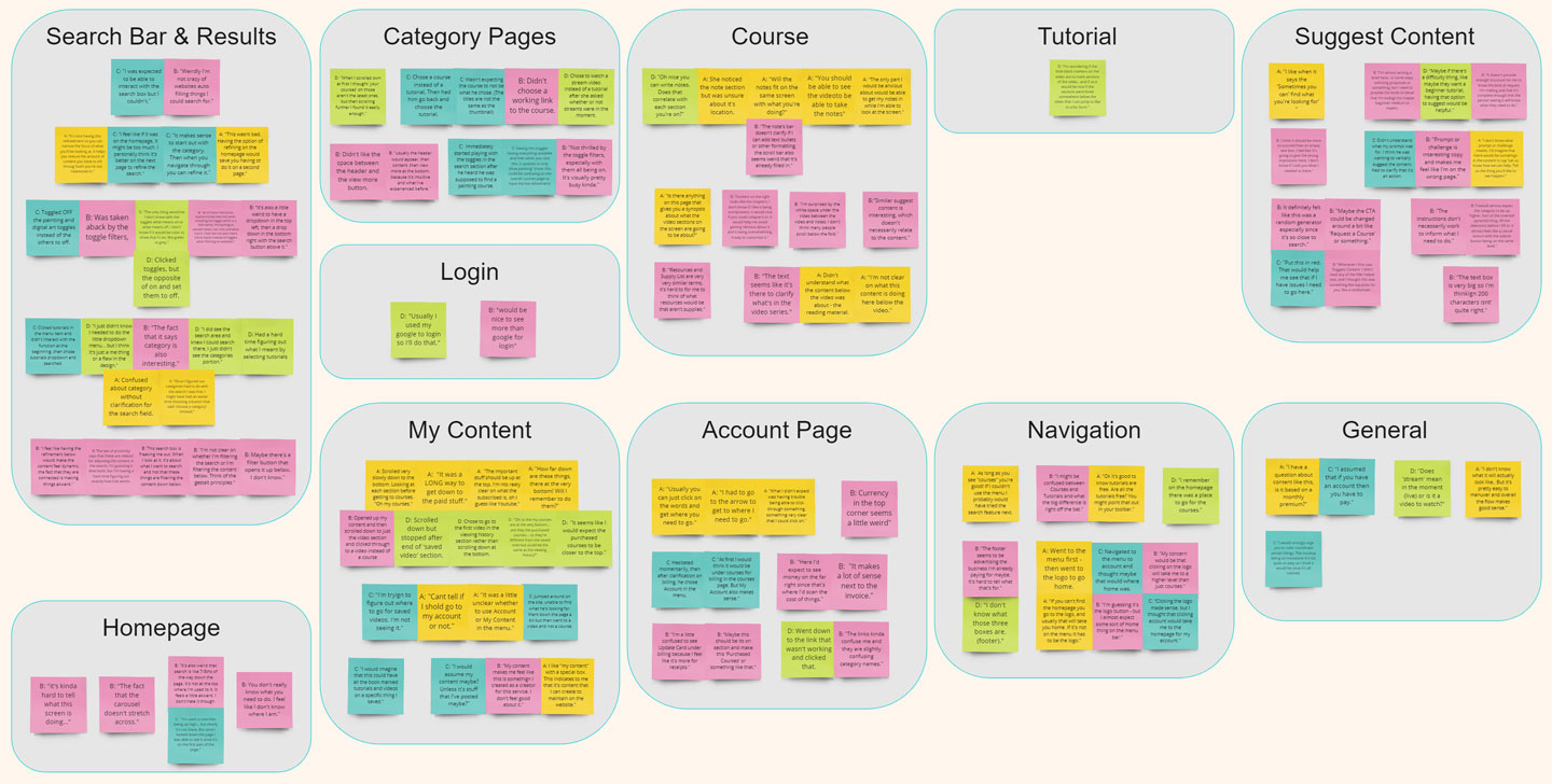
Round 1 : Low-Fidelity Findings
The current search engine option was not intuitive
Users had a hard time finding saved content due to current structure
The notes section of the course page didn’t have a proper function
Suggest content feature was too broad and confusing
Round 2 : High-Fidelity Findings
Toggles on the refine search did not work properly, and were not ideal
Color scheme on video thumbnails was confusing
Users needed the search bar to be higher up on the screen
Iteration
Summary
I conducted two rounds of usability studies. The first study of our low-fidelity application revealed key insights that guided iterations in the design. The second study of our high-fidelity application revealed additional iterations that needed to be completed.
Home Screen Iterations
The homepage required some simplification for users to understand a lot of the various purposes of each section. They also needed a simple search bar and the important stuff near the top. I reduced the overall size of sections into thumbnails and reduced a lot of the options that sections had to reduce confusion.
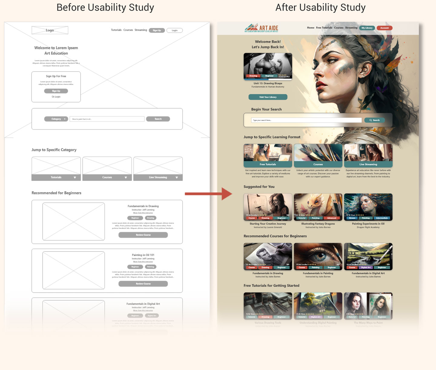
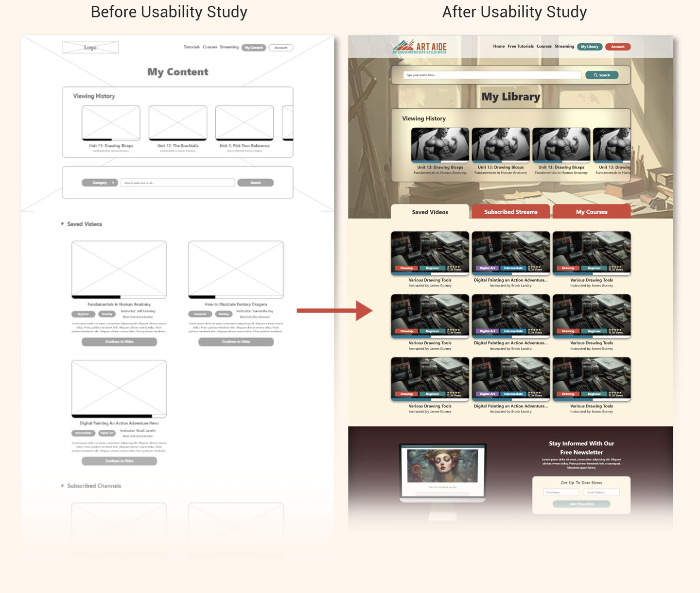
Media Library Iterations
While being able to access all of the saved content was a great benefit to users – the way it was presented made it difficult to find what they were looking for. Rather than lay out all of the content top to bottom, I transitioned to a tab system that allowed users to open tabs for each category of saved content “Saved Videos” “Subscribed Streams” and “My Courses”
Conclusion
Summary
I conducted two rounds of usability studies. The first study of our low-fidelity application revealed key insights that guided iterations in the design. The second study of our high-fidelity application revealed additional iterations that needed to be completed.
Impact
The designs succeeded in providing art enthusiasts a way to navigate and find content that would improve their skills and knowledge in art. While there are many features that could still be added, this proved to be a platform that met a lot of user needs.
What I Learned
I learned that there are many levels of art education and skills which require a vast database of information that is properly teachable and actionable.
Let's connect

Thank you for your interest in my design process of Art Aide’s art education website. If you’d like to see more of my designs or contact me, please reach out!
Email: ian@ianholadayui.com
Additional Portfolio: ianholaday.com