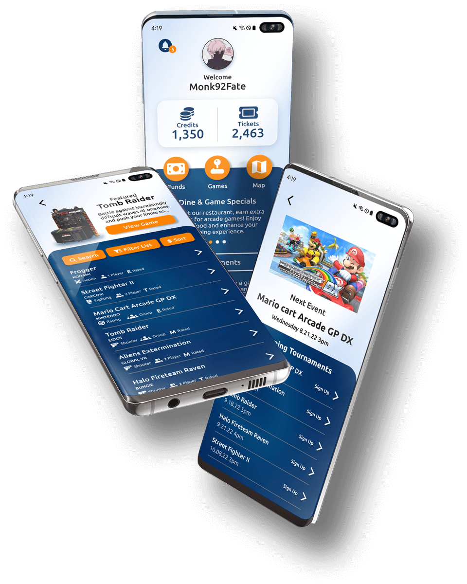
Mobile Application
BOSS LEVEL ARCADE APP
Duration:
June 2022 – December 2022
Role:
UX Researcher, UI Designer
Responsibilities:
User Research, Wireframing, Mockup, Low-Fidelity & High-Fidelity Prototyping, Usability Studies
If prototype fails to load, try using an alternative browser.
Project Overview
Summary
This is an application for a new gaming arcade that acts as a supportive tool for the customer. It provides insight into what games are available and helps the players plan their best and most enjoyable experience.
The Problem
There is a lack of information related to the types of games that are present at a particular arcade, creating a series of pain points for the customers.
The Goal
Create an application that serves as a solution to provide insight to the customer and act as a supportive tool to enhance the gaming experience.

Accomplishments
Create an application that serves as a solution to provide insight to the customer and act as a supportive tool to enhance the gaming experience.
Key Challenges & Constraints
Create an application that serves as a solution to provide insight to the customer and act as a supportive tool to enhance the gaming experience.
Initial research
Market Research
I interviewed 5 participants ages 30-50 and asked them about their typical arcade experience. Then I did mock interviews utilizing 4 pre-provided user biographies, answering the questions to the best of my assumptions.
I assumed that knowing the types of games that were available would be highly important. However I found that the education of specific games wasn’t necessary the primary need of the user.
Instead, I found there were a lot of pain points that were not being addressed by any other arcade application available on the market. This uncovered potential for creating a preview application that took a more supportive role in the arcade experience.
Competitive Analysis
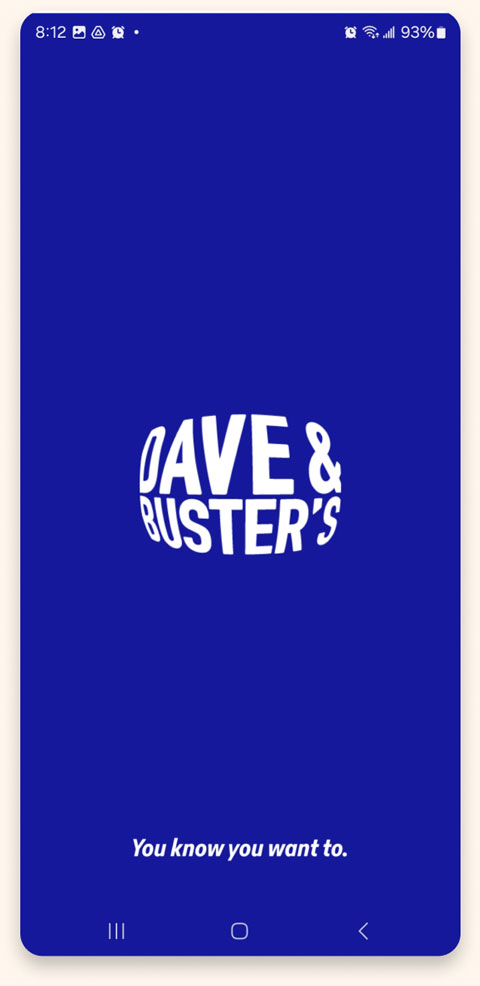
Our key competitors are Dave & Busters, a country-wide arcade and dining company, and Chuck-E-Cheese, an arcade designed particularly for the younger generation. Dave & Busters is a direct competitor to my company as well as Chuck-E-Cheeze. An indirect competitor is Adventure Island, an all-around entertainment and water park.
Adult and family gaming with fine dining experience

Ideal place for kids to play and eat

Action packed experience and fun for the whole family
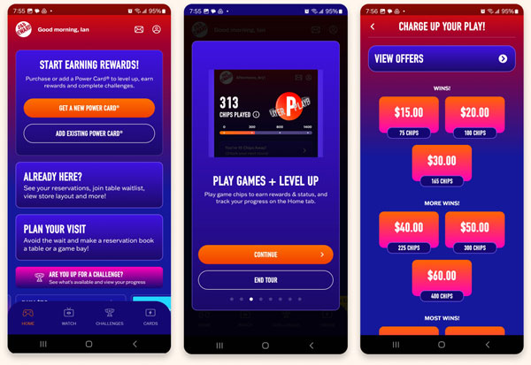
Dave & Busters
The Good
- Excellent use of type, images, and color to emphasize the company brand
- Ability to charge playing card and monitor the balance
- Simple and clean navigation
- Excellent onboarding process with a detailed tour of the application on first use
The Bad
- Content can be a bit too overwhelming visually
- There are no game descriptions on their application
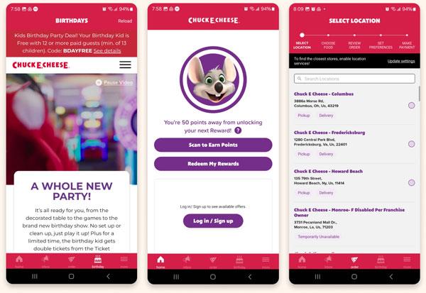
Chuck E. Cheese
The Good
- Ability to charge playing card and monitor the balance
- E-Ticketing system that keeps game tickets digital
The Bad
- No descriptions of games at the arcade
- No accessibility options
- Too invasive with required information to start experience
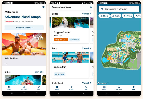
Adventure Island
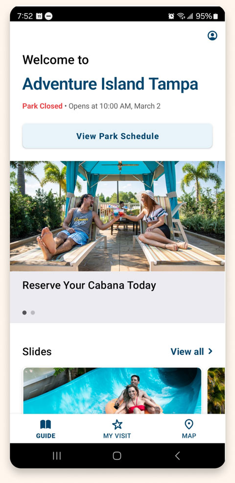
The Good
- Dynamic and easy-to-navigate list of attractions
- Detailed descriptions of each attraction
- A GPS map that helps visitors find their way to each attraction
The Bad
- Repetitive imagery
- Lack of branding / voice / tone
All About The User
Our key competitors are Dave & Busters, a country-wide arcade and dining company, and Chuck-E-Cheese, an arcade designed particularly for the younger generation. Dave & Busters is a direct competitor to my company as well as Chuck-E-Cheeze. An indirect competitor is Adventure Island, an all-around entertainment and water park.
“Users have a hard time tracking their credits and doing drugs on the weekends thanks dad…”

“Users have a hard time tracking their credits and doing drugs on the weekends thanks dad…”

“Users have a hard time tracking their credits and doing drugs on the weekends thanks dad…”

Pain Points

Confusing Costs
Users have a hard time tracking their credits and how much money they are actually spending at the arcade.

Gauging Maturity
Family members with young children do not want their kids playing games that are inappropriate for their age group.

Finding Games
Users have a hard time finding games that they and their family/friends will want to play.

Faulty Machines
Encountering broken, unclean or glitchy games and not being able to do anything about it.

Persona Development & User Journeys
After carefully compiling my findings from the initial interviews and my market research, I crafted 4 user personas that best articulated my user archetypes from these 9 interviews. Each persona represents various age groups, demographics, and interest levels in the arcade experience.
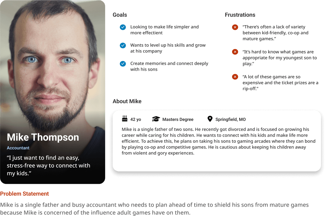
Mike Thompson
Parent with Children
Identified the key feature of being able to filter out certain game maturity ratings and identify them on a map.
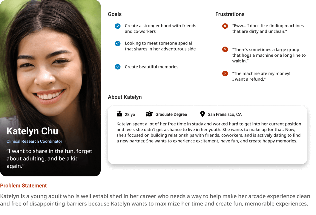
Katelyn Chu
Career Minded Youth
Provided insight to the importance of being able to flag a game for damages or malfunctions.
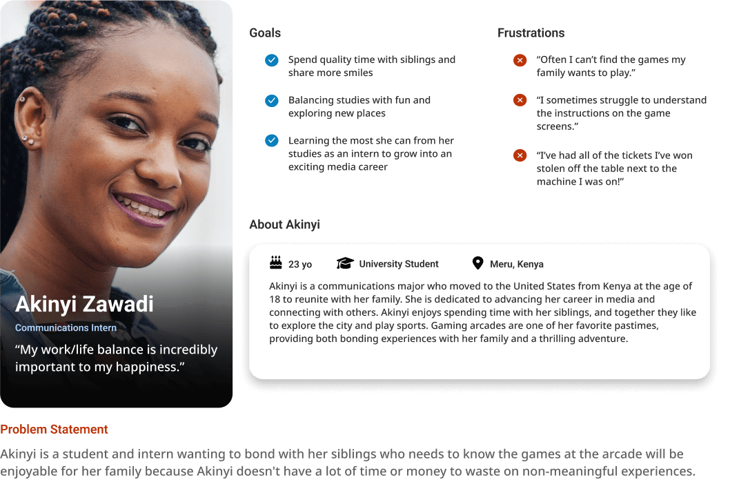
Akinyi Zawadi
Family Minded Student
Identified key categories to include in filtering the game list.
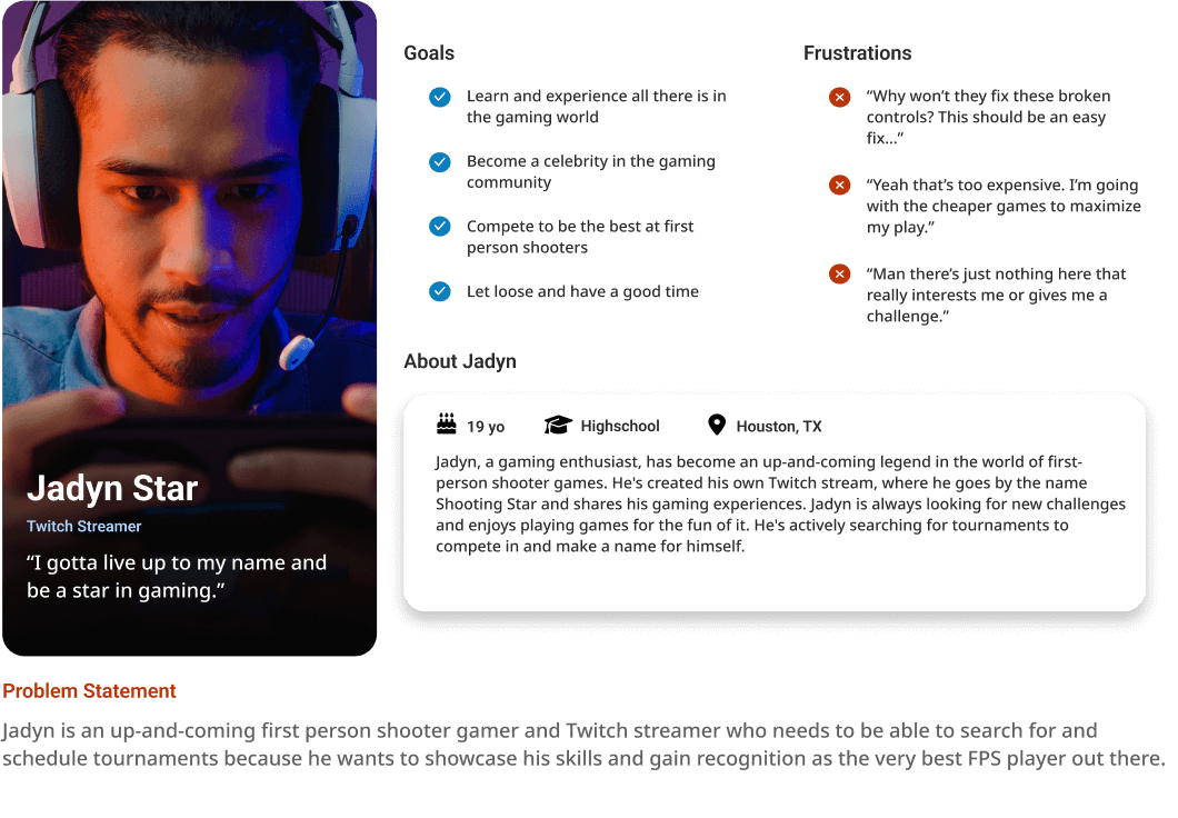
Jadyn Star
Avid Gamer
Determined the importance of having tournament sign-ups easily available on the application.
Mike Thompson
Katelyn Chu
Akinyi Zawadi
Jadyn Star
Design
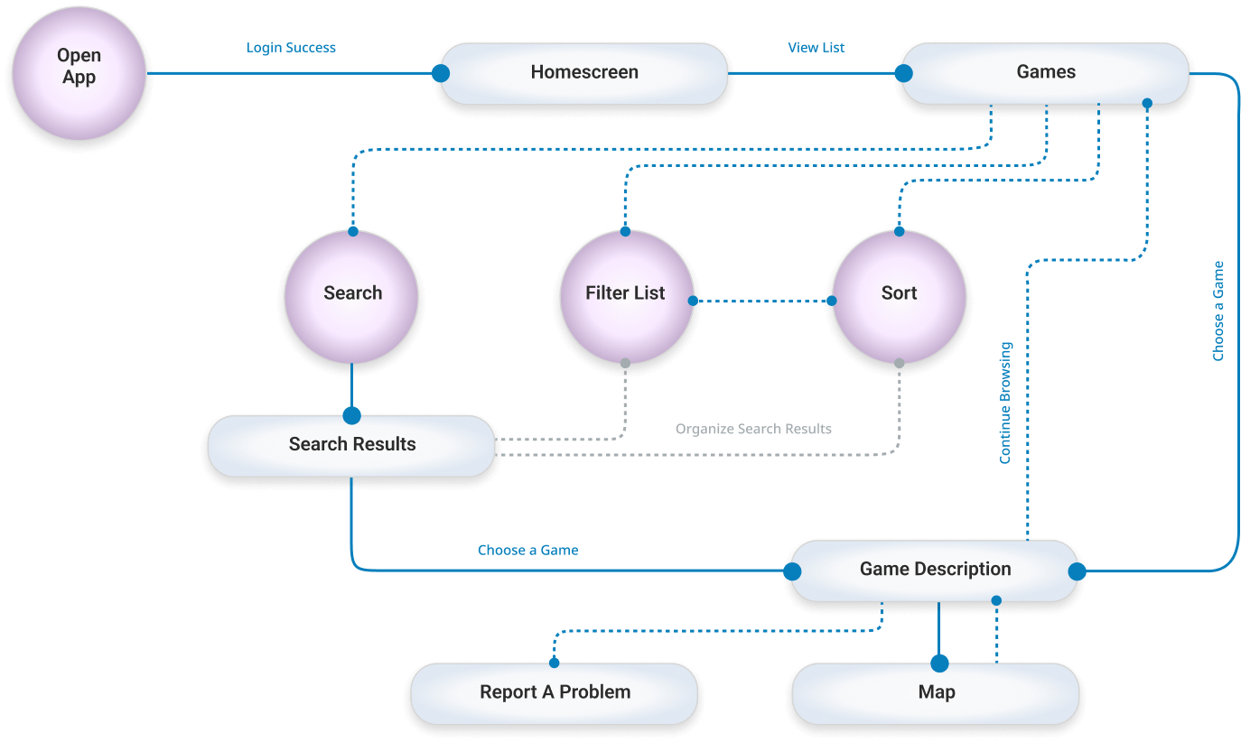
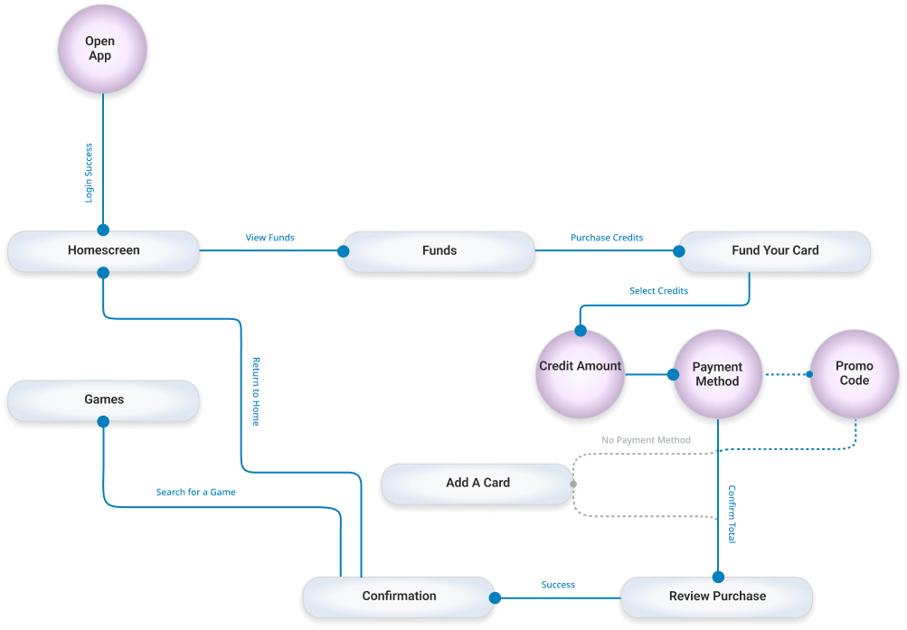
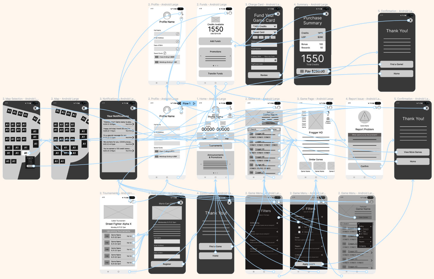
User Flow Diagrams
Lorem ipsum dolor sit amet, consectetur adipiscing elit. Aliquam ultrices viverra tellus. Proin pulvinar hendrerit felis a consequat. Maecenas quam lorem, ullamcorper nec luctus sed, molestie vel mauris. Vestibulum nec urna non lacus tincidunt accumsan a sit amet velit. Nam ac sem ut nulla venenatis ultricies.
Finding A Game Flow
Adding Credits to Account Flow
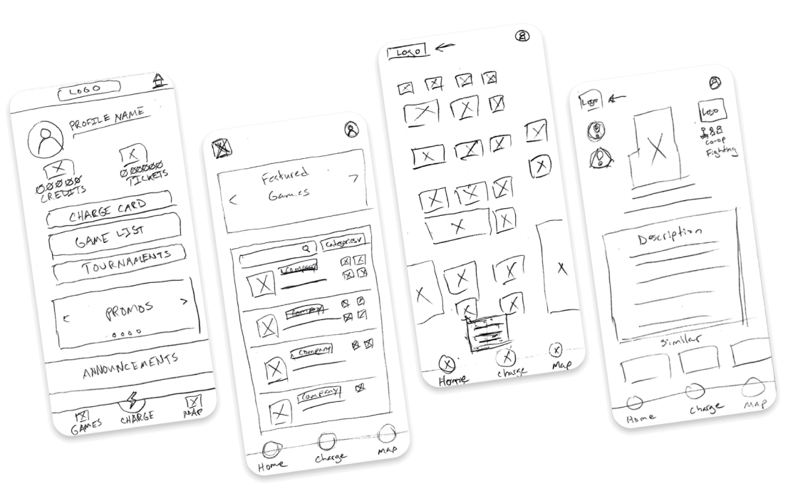
Low-Fidelity Wireframes
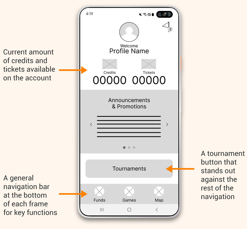
Drafting multiple options for the home screen ensured that the most important pain points of our user personas were addressed with appropriate options in the digital wireframes. I provided quick menu items and prioritized funds and funding an account.
Pencil Wireframes
Digital Wireframes
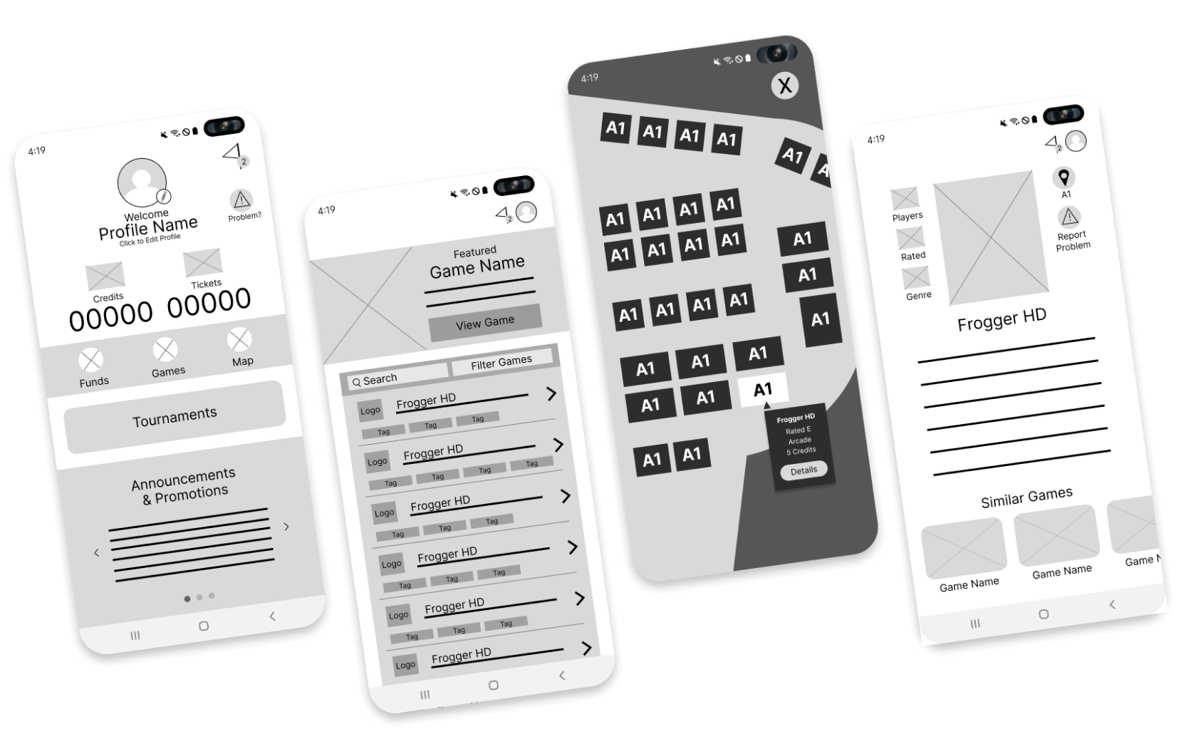
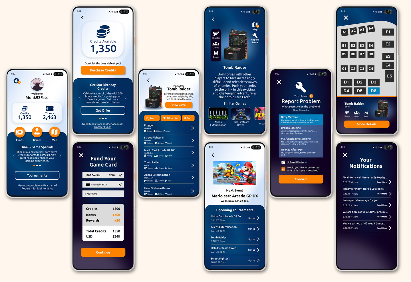
Home Screen
During the design phase, I reflected on the insights that were gleaned from my user research and interviews. Making key navigation objectives easy to find was a top priority as well as informing the user of their total funds.
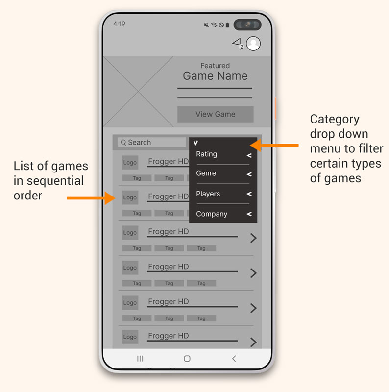
Game List
A way to categorize and filter out specific games on the games list was a high priority for most users, so a quick and simple option was provided.
Low-Fidelity Prototype
The low-fidelity prototype provided the primary user flows for looking and filtering for a specific game, signing up for tournaments, adding funds to a game card, and most importantly the ability to report a problem with a machine.
Accessibility considerations
The low-fidelity prototype provided the primary user flows for looking and filtering for a specific game, signing up for tournaments, adding funds to a game card, and most importantly the ability to report a problem with a machine.
Appropriate colors were considered to address contrast for those with poor eyesight.
Used icons to make navigation clear and informative.
Included descriptive text within the category filtering process to provide clear guidance on how to make an appropriate selection.
Color Palette

Font Style
Ubuntu
Regular, Medium, Bold
AaBbCcDdEeFfGgHh
AaBbCcDdEeFfGgHh
AaBbCcDdEeFfGgHh
Originally Designed for Android
Original designs were closely attached to the Samsung Android native navigation. With the back button at the bottom right and the time and date at the top. My initial prototype utilized this native feature. However, after user testing showed that anyone not used to the interface, had a difficult time navigating. In order to make the app more acceptable across devices, I switched to a more global means of moving backwards through the user journey. I focused on the native Samsung UI and camera.
Iterating for iPhone Experience
After multiple user testing sessions, it became clear that users who were not familiar with the native Android interface were challenged with navigating backward in the app. This led me to the conclusion that creating a system for navigation that worked for all platforms would be ideal and moved all back buttons and closing buttons to the top left-hand corner.
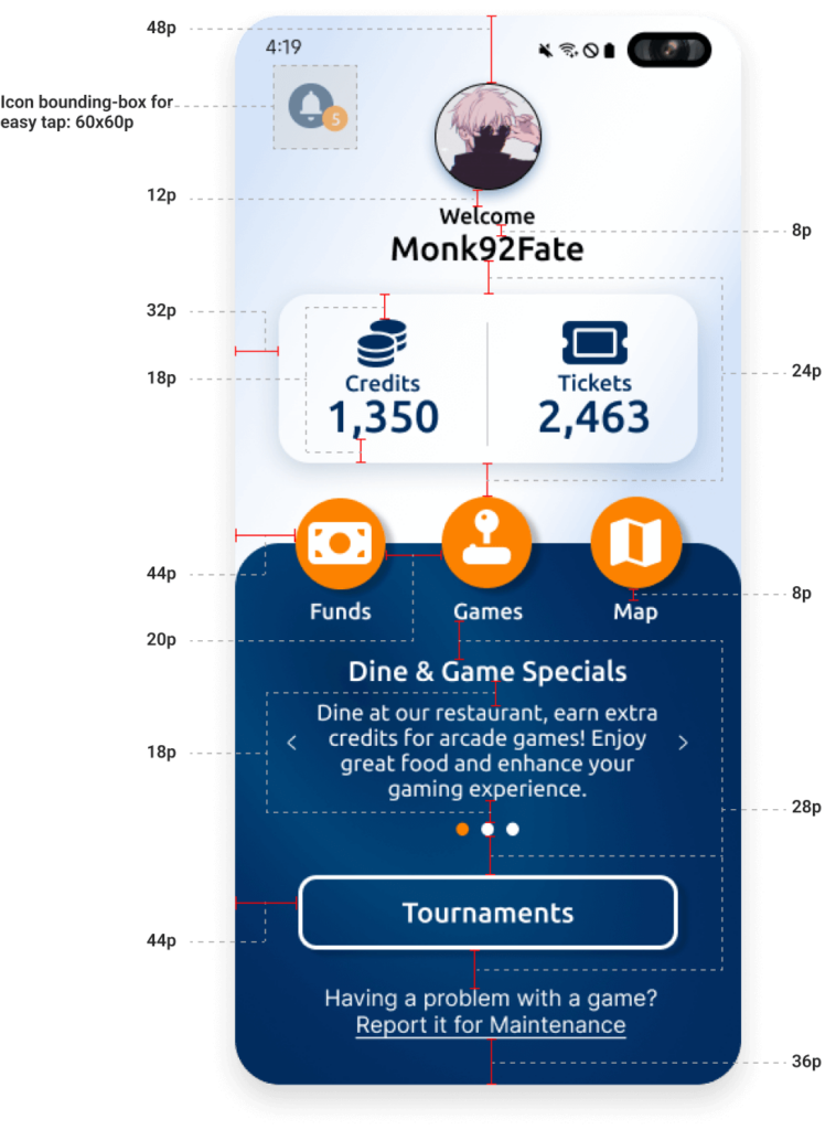
Designing for Grid Alignment
Making sure the application would be functionally sound and visually appealing meant following a specific pixel spacing structure that would be easily programmable. I decided to work with a 4-point grid structure, making sure all spacing between elements was divisible by 4.
Usability testing
Summary
I conducted two rounds of usability studies. After taking detailed notes and reviewing the recordings of my studies, I set out to develop an affinity diagram where I sorted out user’s challenges to find commonalities and trends. The first study of our low-fidelity application revealed key insights that guided iterations in the design to better the overall experience. The second study of our high-fidelity application revealed additional iterations that needed to be completed. One major change was adding a sorting option to the game search screen.
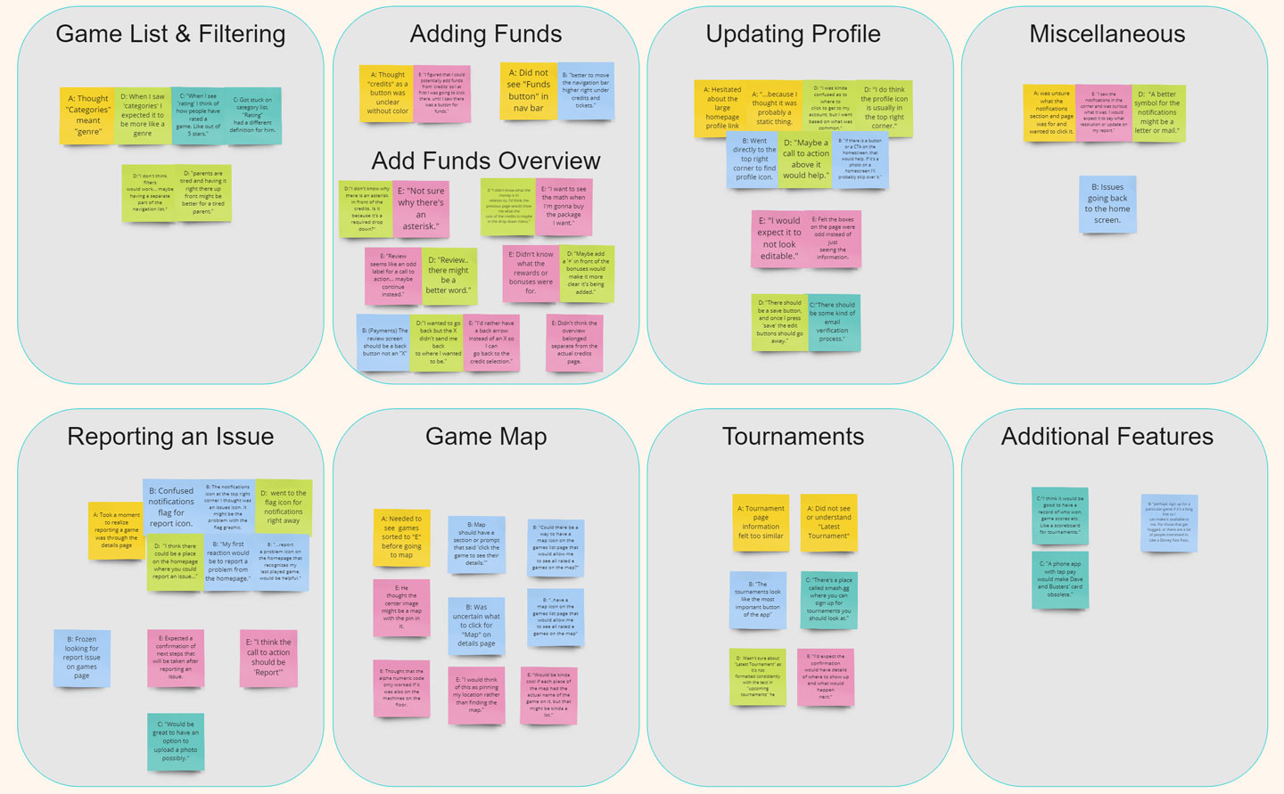
Round 1 : Low-Fidelity Findings
Unsure where to update profile from homepage
Language used for filters ineffective
Reporting a problem is a most urgent task
Need only 1 path to “Funds” page
Round 2 : High-Fidelity Findings
Toggles on categories page should be updated to correct orientation
Navigation is confusing to users using native android controls
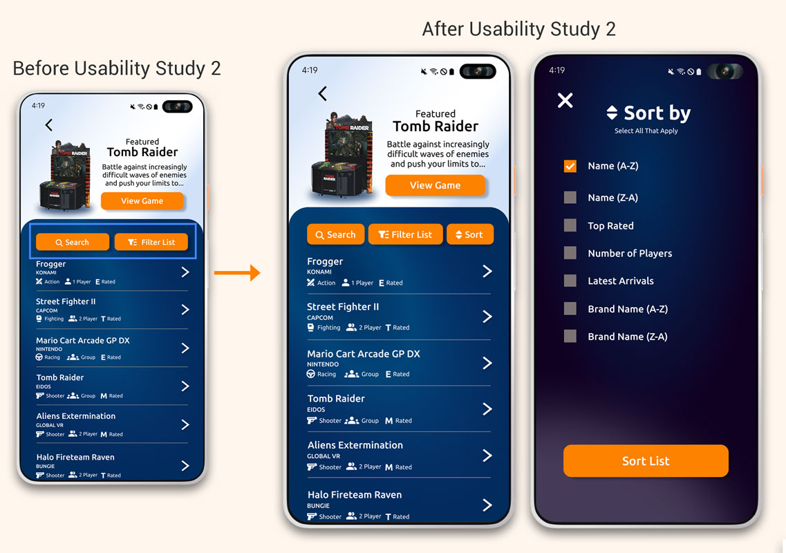
Users wanted the ability to sort the lists after filtering their inquiry
Bonus credits should stand out
Iteration
Summary
Both usability sessions provided me great insight into the challenges my users faced when working through my designs. Most of which I was quite surprised about, and grateful for the testing experience.
Round 1
Low-Fidelity Iterations
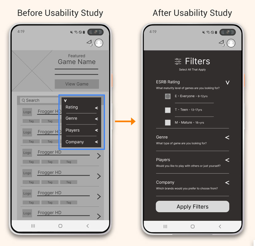
The language used in the filters menu did not inform their function correctly to the user. So I designed a new set of options with descriptive text for each item. Making the options fit the screen ensured a user could easily navigate the menu with a thumb.
Round 2
High-Fidelity Iterations
Users were frustrated that they could not sort their game selections in the menu, so a sort feature was added to the game lists page to provide the ability to sort by various directions.
Conclusion
Summary
I conducted two rounds of usability studies. The first study of our low-fidelity application revealed key insights that guided iterations in the design. The second study of our high-fidelity application revealed additional iterations that needed to be completed.
Impact
The app made users feel like Boss Level’s arcade application had everything they could possibly need for an excellent arcade experience.
What I Learned
While designing Boss Level’s arcade application, I learned the importance of good initial research to identify appropriate pain points and concerns. I also learned that the process is a fully iterative one, guided by user testing and insights.
Let's connect

Thank you for your interest in my design process of Boss Level’s arcade application. If you’d like to see more of my designs or contact me, please reach out!
Email: ian@ianholadayui.com
Additional Portfolio: ianholaday.com