Multi-Platform Web Application
NEW TO PARENTING EDUCATION
Duration:
March 2023 – May 2023
Role:
UX Researcher, UI Designer
Responsibilities:
User Research, Wireframing, Mockup, Low-Fidelity & High-Fidelity Prototyping, Usability Studies
If prototype fails to load, try using an alternative browser.
Project Overview
Summary
This multi platform educational tool is a robust and easily utilizable resource for new parents to learn proper parenting techniques, addressing unique and diverse problems in the parenting journey for all parents.
The Problem
There is a lack of resources for parents that are expecting or have just become a parent. The resources that are available do not address the unique circumstances of which a person can become a parent or offer any specific guidance to navigate those challenges.
The Goal
Create an app, and website that helps parents learn key skills and provide support along their journey in an easily consumable and relaxed manner.

Accomplishments
Create an application that serves as a solution to provide insight to the customer and act as a supportive tool to enhance the gaming experience.
Key Challenges & Constraints
Create an application that serves as a solution to provide insight to the customer and act as a supportive tool to enhance the gaming experience.
Initial research
Market Research
I did preliminary research that revealed that there were many ways in which a person becomes a new parent that doesn’t always involve birthing a baby. And because of these many possibilities, the ages and the needs of those children differed greatly.
I interviewed 6 participants ages 30-70 and asked them about their parenting experience. Some couples were newly expecting, while others were just becoming parents. I also interviewed step-parents and long-term past parents to ensure I covered as much as possible.
I assumed that most expecting parents were somewhat aware of what they needed to learn and had taken some steps to be prepared, but I was surprised to find that most were completely ignorant of the ways of parenting.
Competitive Analysis
An audit I did of a few competitors, 1 main competitor, and 2 similar but different industries. This helped me identify key features that I wanted to include in my product. Cleo direct Noom indirect Duolingo indirect.
Adult and family gaming with fine dining experience
Ideal place for kids to play and eat

Action packed experience and fun for the whole family
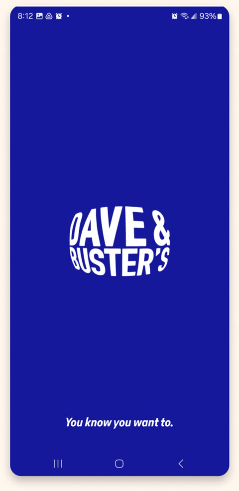
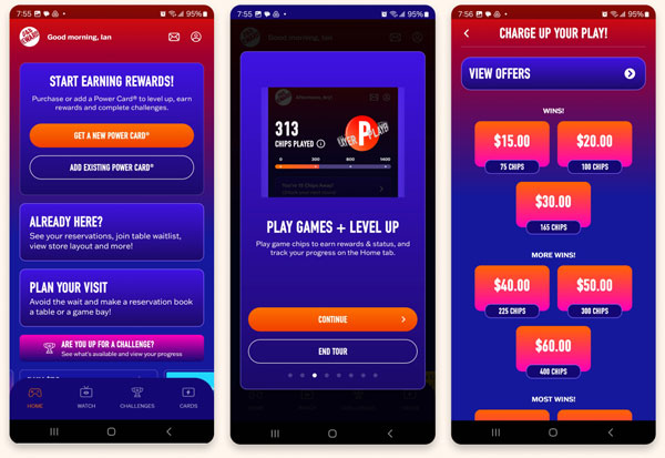
Dave & Busters
The Good
- Excellent use of type, images, and color to emphasize the company brand
- Ability to charge playing card and monitor the balance
- Simple and clean navigation
- Excellent onboarding process with a detailed tour of the application on first use
The Bad
- Content can be a bit too overwhelming visually
- There are no game descriptions on their application
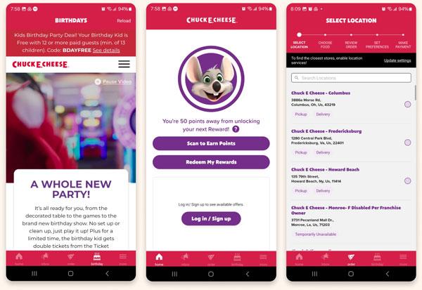
Chuck E. Cheese
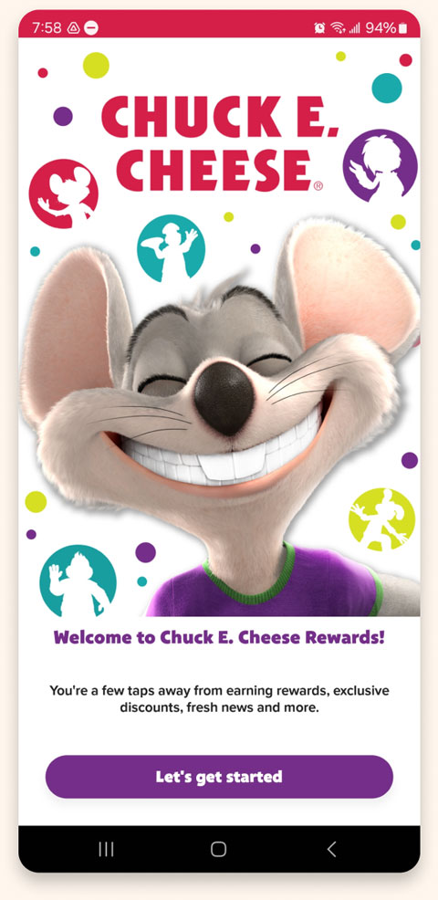
The Good
- Excellent use of type, images, and color to emphasize the company brand
- Ability to charge playing card and monitor the balance
- Simple and clean navigation
- Excellent onboarding process with a detailed tour of the application on first use
The Bad
- Content can be a bit too overwhelming visually
- There are no game descriptions on their application
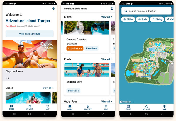
Adventure Island
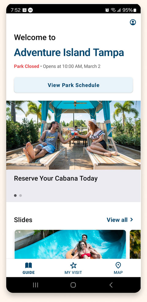
The Good
- Excellent use of type, images, and color to emphasize the company brand
- Ability to charge playing card and monitor the balance
- Simple and clean navigation
- Excellent onboarding process with a detailed tour of the application on first use
The Bad
- Content can be a bit too overwhelming visually
- There are no game descriptions on their application
All About The User
Our key competitors are Dave & Busters, a country-wide arcade and dining company, and Chuck-E-Cheese, an arcade designed particularly for the younger generation. Dave & Busters is a direct competitor to my company as well as Chuck-E-Cheeze. An indirect competitor is Adventure Island, an all-around entertainment and water park.
“Users have a hard time tracking their credits and doing drugs on the weekends thanks dad…”

“Users have a hard time tracking their credits and doing drugs on the weekends thanks dad…”

“Users have a hard time tracking their credits and doing drugs on the weekends thanks dad…”

Pain Points

Lack of Knowledge
Parents mentioned concerns about their lack of knowledge in parenting, especially in different aspects such as sleep patterns, developmental milestones, and feeding techniques

Managing Emotions
Users that were new to parent found it difficult to control their emotions and navigate how their emotions impact their children.

Neglecting Self-Care
Users did not prioritize their own needs or health. This was a common issue among all parents and negatively affected their ability to parent properly.

Community Support
New parents were in need of a supportive community and the ability to get answers quickly when the need arises.

Persona Development & User Journeys
I crafted 4 user personas that best articulated my user archetypes from these 9 interviews. I crafted 4 user personas that best articulated my user archetypes from these 9 interviews. I crafted 4 user personas that best articulated my user archetypes from these 9 interviews.

Emily
First-Time Parent
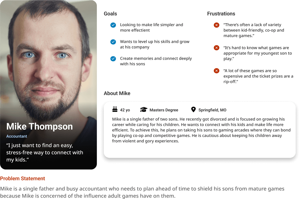
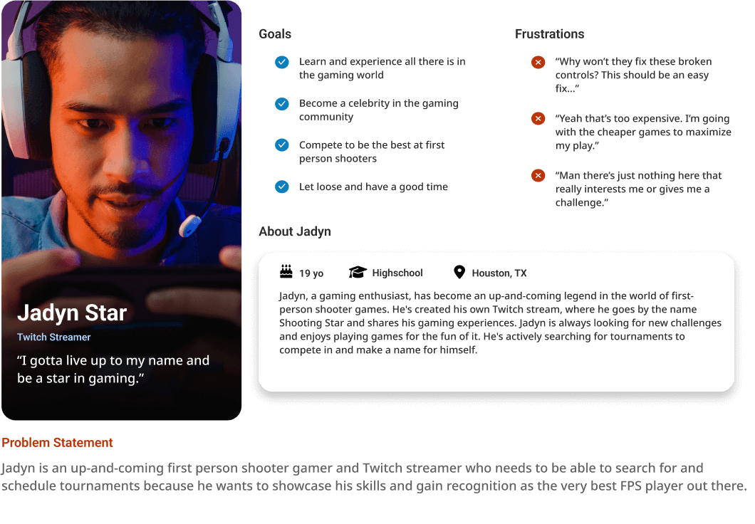
Identified the key feature of being able to filter out certain game maturity ratings and identify them on a map.

Alex
Surrogate Parent
Provided insight to the importance of being able to flag a game for damages or malfunctions.

Samantha
Step-Parent
Identified key categories to include in filtering the game list.

Ken & Ryan
Same-Sex Parents
Determined the importance of having tournament sign-ups easily available on the application.
Mike Thompson
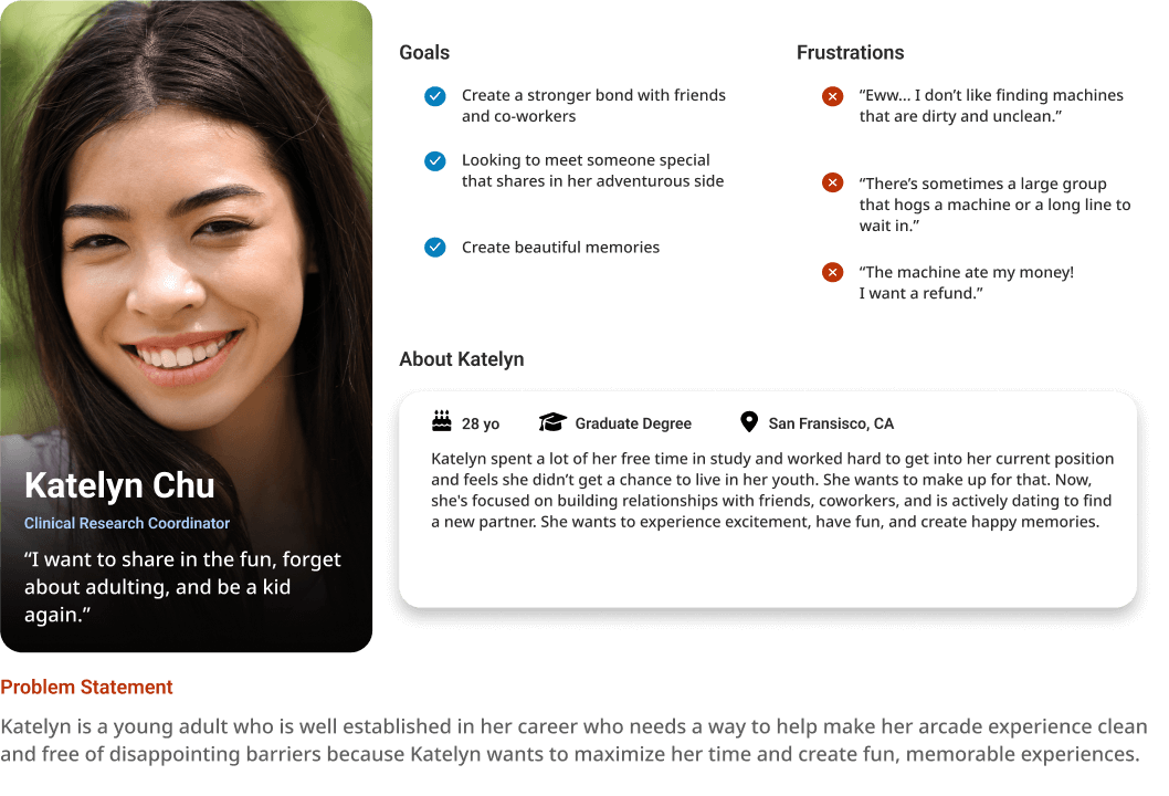
Katelyn Chu
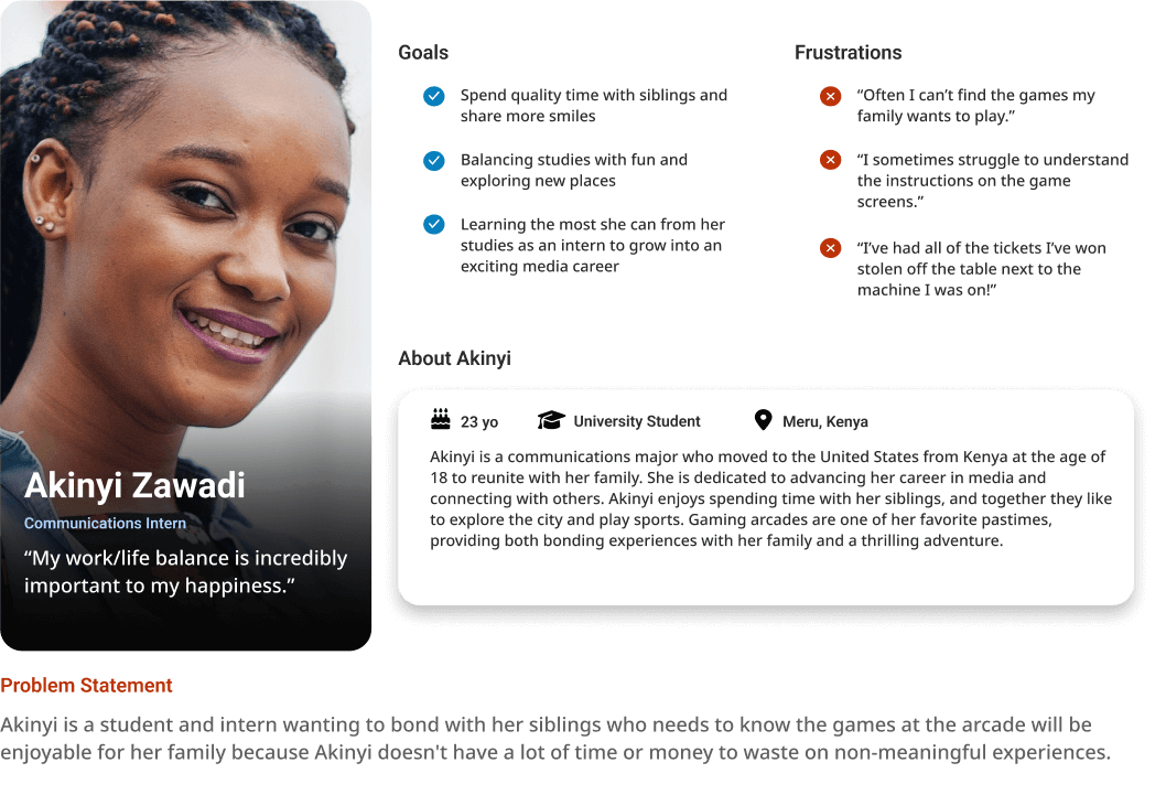
Akinyi Zawadi
Jadyn Star
Design
Crazy 8s
I sat down and worked out a crazy 8’s exercise, exploring all of the possible ways that I could meet the users’ needs.
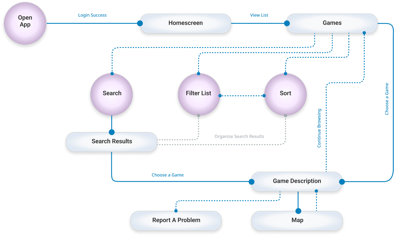
Finding A Game Flow
Lorem ipsum dolor sit amet, consectetur adipiscing elit. Aliquam ultrices viverra tellus. Proin pulvinar hendrerit felis a consequat. Maecenas quam lorem, ullamcorper nec luctus sed, molestie vel mauris.
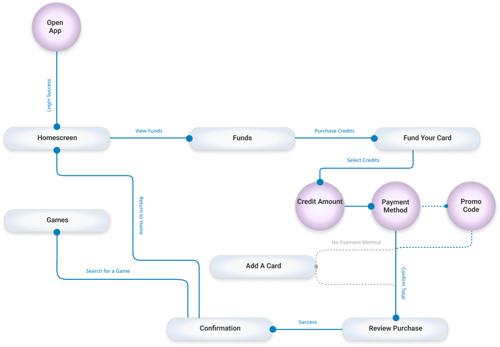
Adding Credits to Account Flow
Lorem ipsum dolor sit amet, consectetur adipiscing elit. Aliquam ultrices viverra tellus. Proin pulvinar hendrerit felis a consequat. Maecenas quam lorem, ullamcorper nec luctus sed, molestie vel mauris.
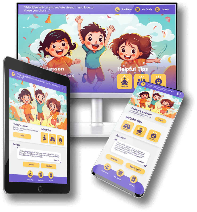
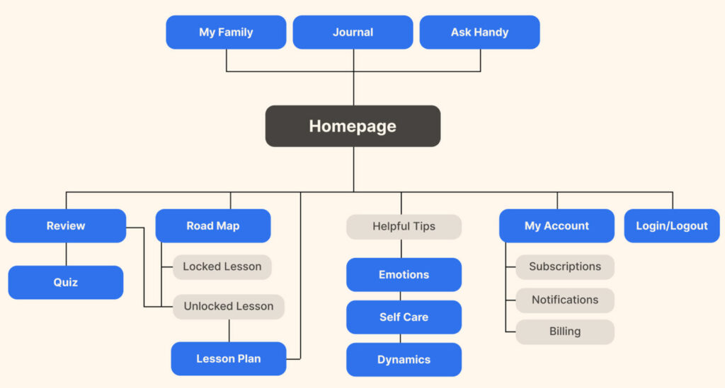
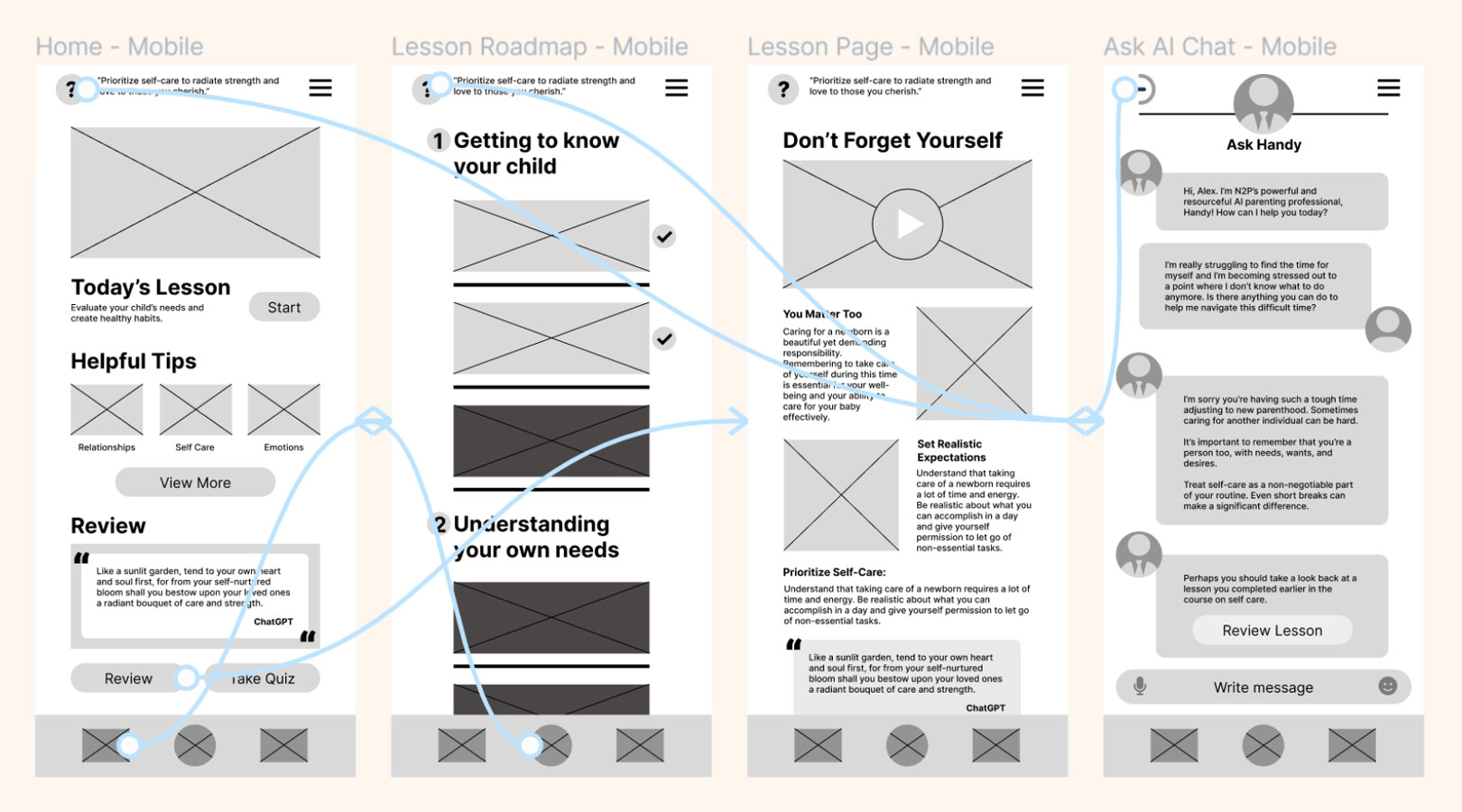
Desktop Website Sitemap
My goal was to have most of the features available on the homepage, just separated into proper groups to make it easy to jump into a new or previous lesson.
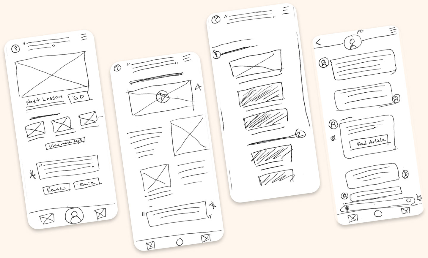
Low-Fidelity Wireframes
I created many versions of various pages and landed on 4 that felt the most intuitive and functional.
During the design phase, I reflected on the insights that were gleaned from my user research and interviews. Making the homepage incorporate the 3 key features in very specific sections was a high priority.
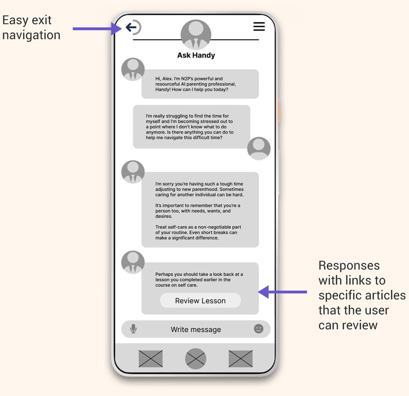
To address the consistent pain point of connecting to specific support networks, I designed an easily accessible AI program that utilizes the complete database of information available in the program to help answer any questions in a fluid and organic way.
Paper Wireframes
Digital Wireframes
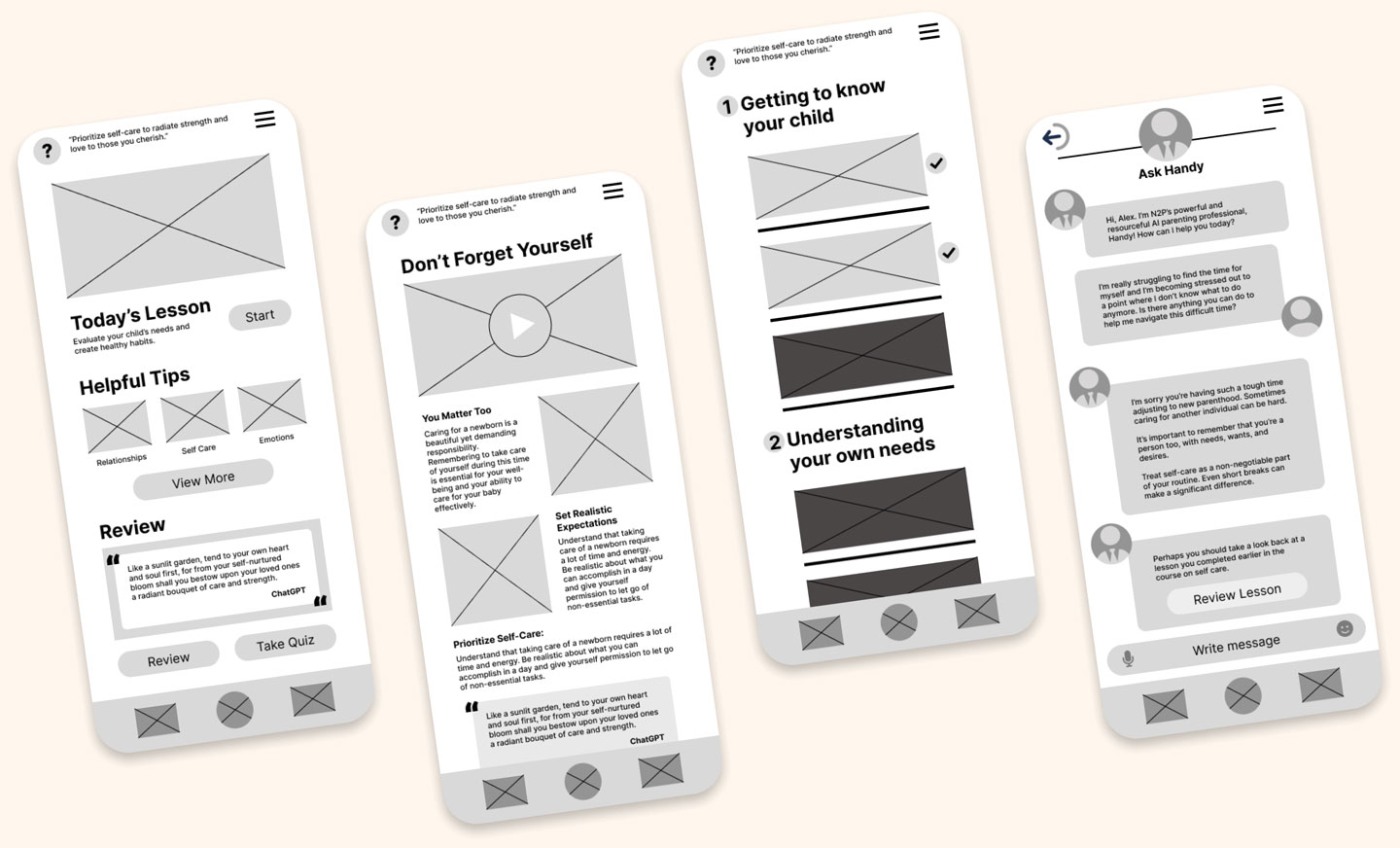
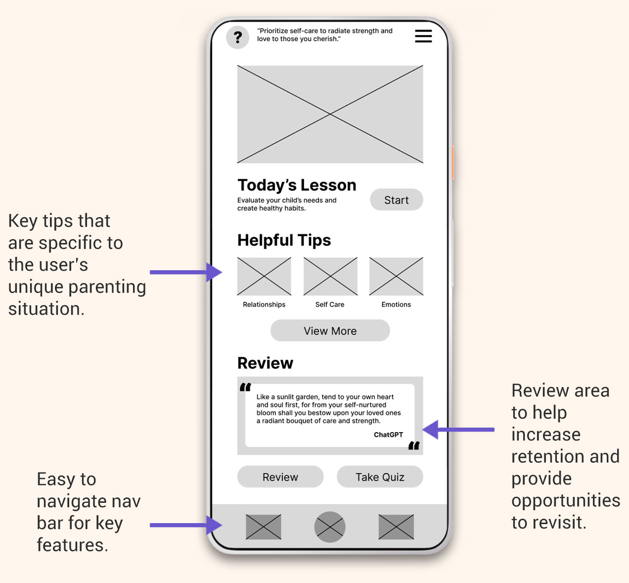
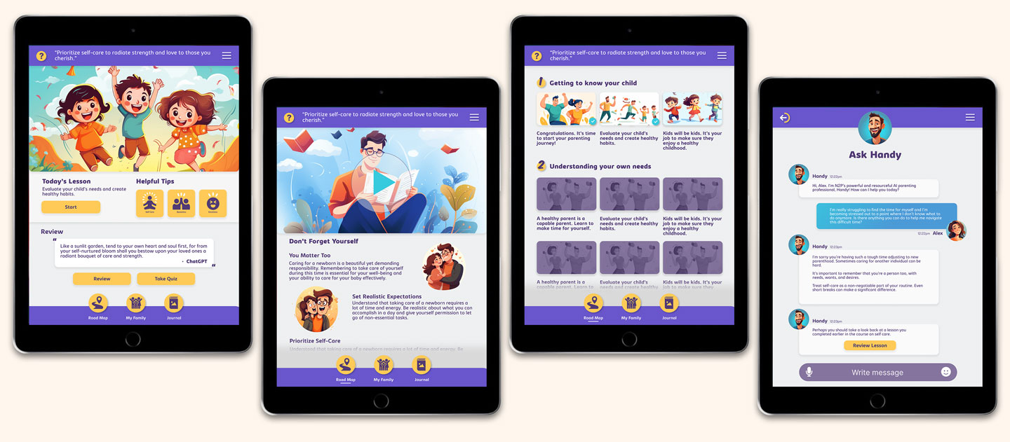
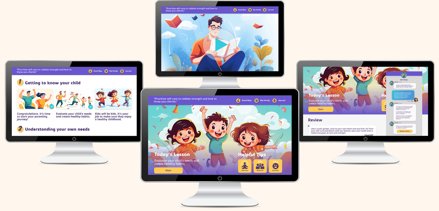
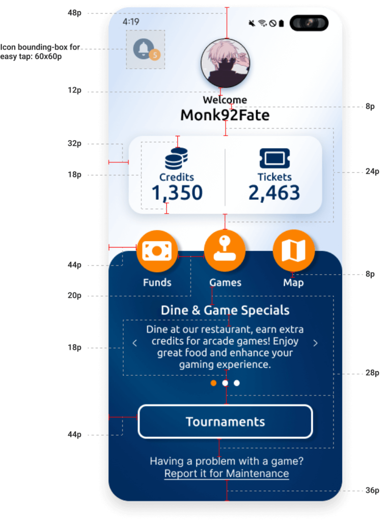
Home Screen
During the design phase, I reflected on the insights that were gleaned from my user research and interviews. Making the homepage incorporate the 3 key features in very specific sections was high priority.
AI Chat Helper
To address the consistent pain point of connecting to specific support networks, I designed an easily accessible AI program that utilizes the complete database of information available in the program to help answer any questions in a fluid and organic way.
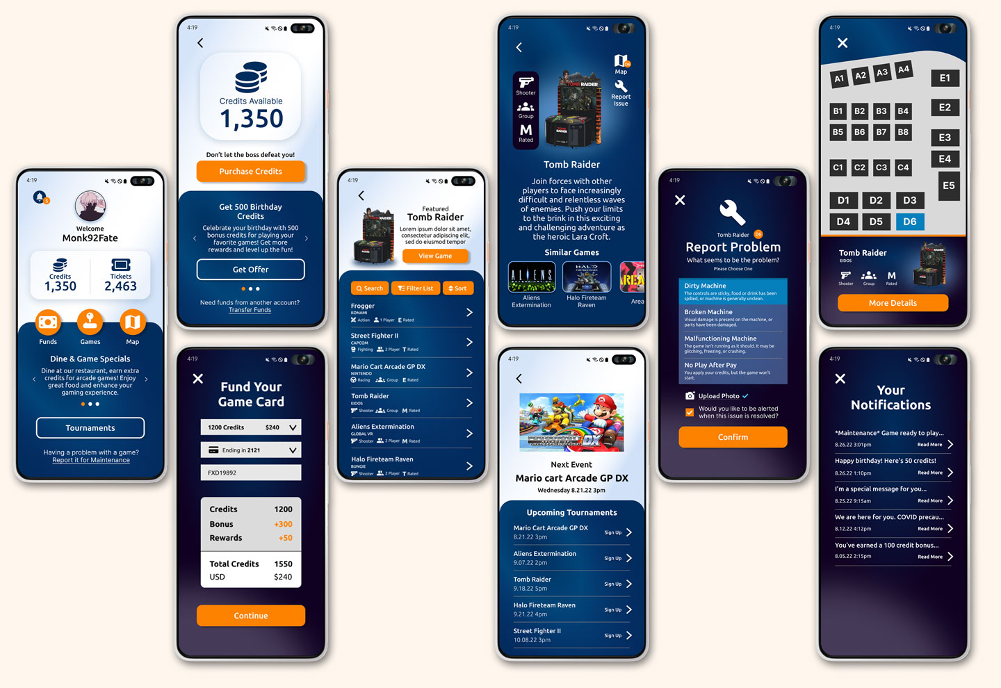
Low-Fidelity Prototype
The low-fidelity prototype provided the primary user flows for looking and filtering for a specific game, signing up for tournaments, adding funds to a game card, and most importantly the ability to report a problem with a machine.
Accessibility considerations
The low-fidelity prototype provided the primary user flows for looking and filtering for a specific game, signing up for tournaments, adding funds to a game card, and most importantly the ability to report a problem with a machine.
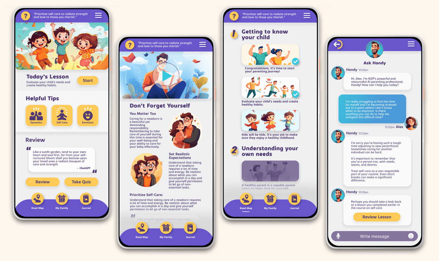
I utilized specific colors that ensured that all buttons and text met usability guidelines specifically for maximum contrast and visibility.
Provided a way to play a programmed voice reading of the text of the article for those who cannot read the article.
Provided closed caption options for videos so that anyone can view and understand the material during any particular situation.
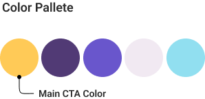
Color Palette
Font Style

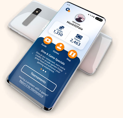
Mobile Mockups
Tablet Mockups
Desktop Mockups
Originally Designed for Android
Original designs were closely attached to the Samsung Android native navigation. With the back button at the bottom right and the time and date at the top. My initial prototype utilized this native feature. However, after user testing showed that anyone not used to the interface, had a difficult time navigating. In order to make the app more acceptable across devices, I switched to a more global means of moving backwards through the user journey. I focused on the native Samsung UI and camera.
Iterating for iPhone Experience
Create an application that serves as a solution to provide insight to the customer and act as a supportive tool to enhance the gaming experience.
Designing for Grid Alignment
Lorem ipsum dolor sit amet, consectetur adipiscing elit. Aliquam ultrices viverra tellus. Proin pulvinar hendrerit felis a consequat. Maecenas quam lorem, ullamcorper nec luctus sed, molestie vel mauris. Vestibulum nec urna non lacus tincidunt accumsan a sit amet velit. Nam ac sem ut nulla venenatis ultricies.
Usability testing
Summary
I conducted two rounds of usability studies. The first study of our low-fidelity application revealed key insights that guided iterations in the design. The second study of our high-fidelity application revealed additional iterations that needed to be completed.
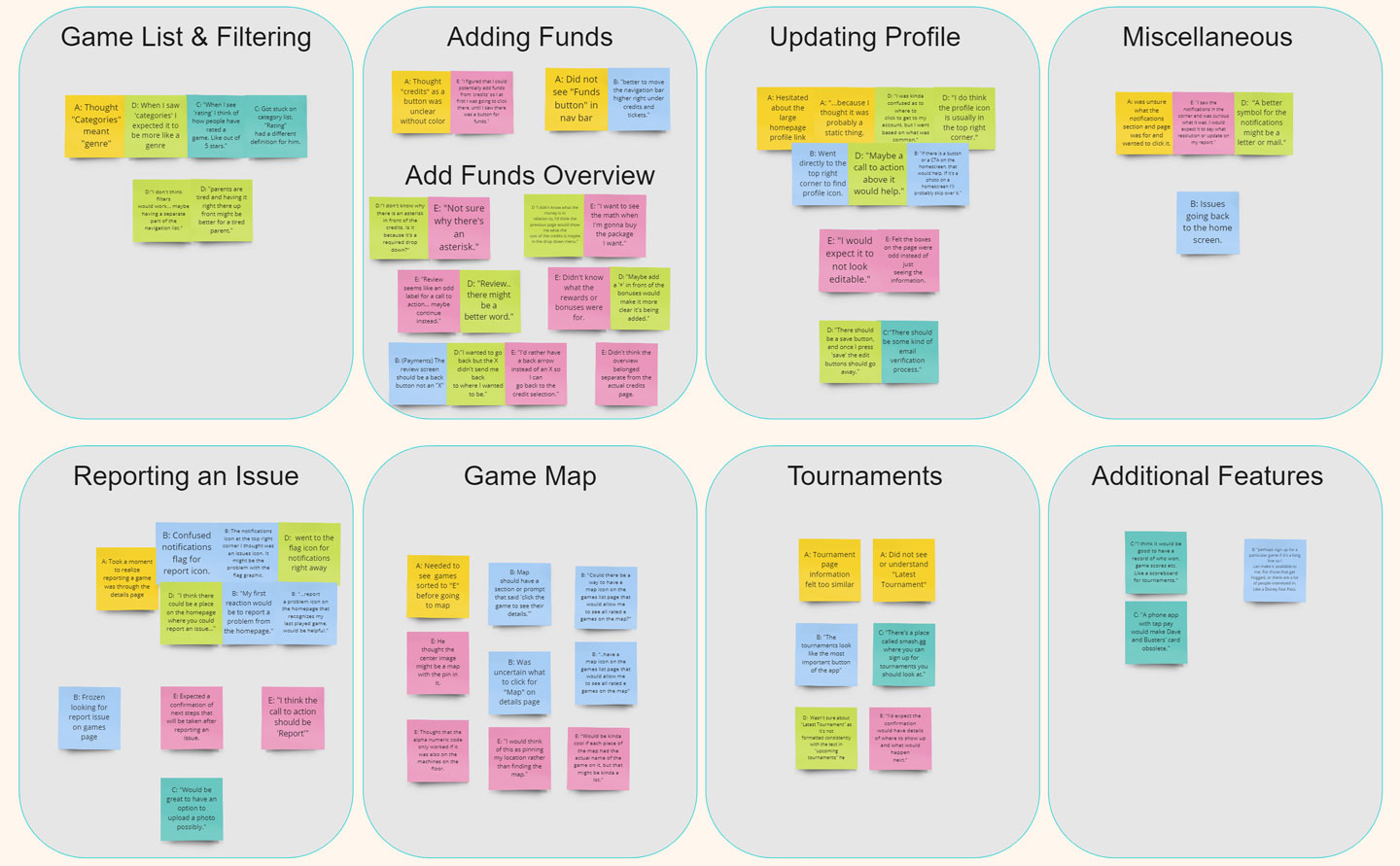
Round 1 : Low-Fidelity Findings
Users had difficult time understanding the journey map
Users found a lack of color made it harder to navigate the app
Helpful tips needed to be more accessible
Round 2 : High-Fidelity Findings
Users wanted to see a visual key that showcased their progress
Users were wanting a way to directly connect with a human
Users wanted to be able to make videos full screen
Iteration
Summary
I conducted two rounds of usability studies. The first study of our low-fidelity application revealed key insights that guided iterations in the design. The second study of our high-fidelity application revealed additional iterations that needed to be completed.
Simplified Navigation
I expanded some of the imagery to help separate the sections more clearly and provide a way for users to appropriately navigate the application on mobile.
More Defined Signifiers
It was important to ensure that the user understood exactly what the next chapter was in their learning journey, properly segmenting each section and coloring it to show what was available and what was currently locked.
Conclusion
Summary
I conducted two rounds of usability studies. The first study of our low-fidelity application revealed key insights that guided iterations in the design. The second study of our high-fidelity application revealed additional iterations that needed to be completed.
Impact
This application has provided real excitement to expecting parents and given them the hope that a product like this will be available soon. This application made the needs very clear for the expecting parents out there.
What I Learned
Parenting can be difficult and come with many obstacles dependant on how one becomes a new parent. The unique needs of these users need to be addressed and given proper support.
Let's connect

Thank you for your interest in my design process of the New to Parenting multi-platform educational web app. If you’d like to see more of my designs or contact me, please reach out!
Email: ian@ianholadayui.com
Additional Portfolio: ianholaday.com